TopAppBar
Composable Component
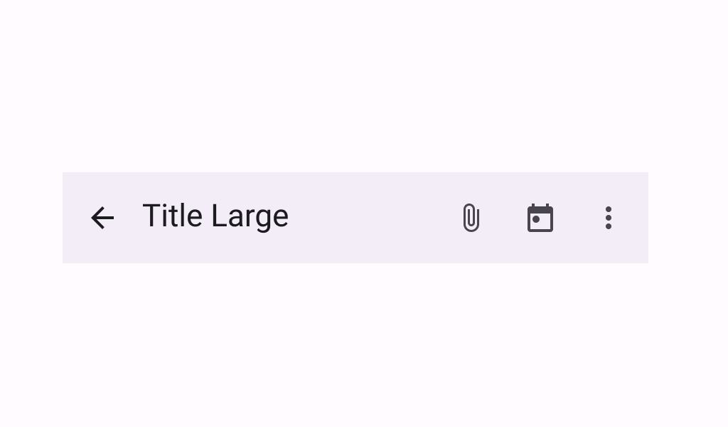
Top app bars display information and actions at the top of a screen.
Common
Deprecated Deprecated in favor of TopAppBar with expandedHeight parameter
@ExperimentalMaterial3Api
@Composable
fun TopAppBar(
    title: @Composable () -> Unit,
    modifier: Modifier = Modifier,
    navigationIcon: @Composable () -> Unit = {},
    actions: @Composable RowScope.() -> Unit = {},
    windowInsets: WindowInsets = TopAppBarDefaults.windowInsets,
    colors: TopAppBarColors = TopAppBarDefaults.topAppBarColors(),
    scrollBehavior: TopAppBarScrollBehavior? = null,
) =
    TopAppBar(
        title = title,
        modifier = modifier,
        navigationIcon = navigationIcon,
        actions = actions,
        expandedHeight = TopAppBarDefaults.TopAppBarExpandedHeight,
        windowInsets = windowInsets,
        colors = colors,
        scrollBehavior = scrollBehavior,
    )
Parameters
| title | the title to be displayed in the top app bar |
| modifier | the Modifier to be applied to this top app bar |
| navigationIcon | the navigation icon displayed at the start of the top app bar. This should typically be an IconButton or IconToggleButton. |
| actions | the actions displayed at the end of the top app bar. This should typically be IconButtons. The default layout here is a Row, so icons inside will be placed horizontally. |
| windowInsets | a window insets that app bar will respect. |
| colors | TopAppBarColors that will be used to resolve the colors used for this top app bar in different states. See TopAppBarDefaults.topAppBarColors. |
| scrollBehavior | a TopAppBarScrollBehavior which holds various offset values that will be applied by this top app bar to set up its height and colors. A scroll behavior is designed to work in conjunction with a scrolled content to change the top app bar appearance as the content scrolls. See TopAppBarScrollBehavior.nestedScrollConnection. |
Common
@ExperimentalMaterial3Api
@Composable
fun TopAppBar(
    title: @Composable () -> Unit,
    modifier: Modifier = Modifier,
    navigationIcon: @Composable () -> Unit = {},
    actions: @Composable RowScope.() -> Unit = {},
    expandedHeight: Dp = TopAppBarDefaults.TopAppBarExpandedHeight,
    windowInsets: WindowInsets = TopAppBarDefaults.windowInsets,
    colors: TopAppBarColors = TopAppBarDefaults.topAppBarColors(),
    scrollBehavior: TopAppBarScrollBehavior? = null,
) =
    SingleRowTopAppBar(
        modifier = modifier,
        title = title,
        titleTextStyle = AppBarSmallTokens.TitleFont.value,
        subtitle = null,
        subtitleTextStyle = TextStyle.Default,
        titleHorizontalAlignment = Alignment.Start,
        navigationIcon = navigationIcon,
        actions = actions,
        expandedHeight =
            if (expandedHeight == Dp.Unspecified || expandedHeight == Dp.Infinity) {
                TopAppBarDefaults.TopAppBarExpandedHeight
            } else {
                expandedHeight
            },
        windowInsets = windowInsets,
        colors = colors,
        scrollBehavior = scrollBehavior,
    )
Parameters
| title | the title to be displayed in the top app bar |
| modifier | the Modifier to be applied to this top app bar |
| navigationIcon | the navigation icon displayed at the start of the top app bar. This should typically be an IconButton or IconToggleButton. |
| actions | the actions displayed at the end of the top app bar. This should typically be IconButtons. The default layout here is a Row, so icons inside will be placed horizontally. |
| expandedHeight | this app bar's height. When a specified scrollBehavior causes the app bar to collapse or expand, this value will represent the maximum height that the bar will be allowed to expand. This value must be specified and finite, otherwise it will be ignored and replaced with TopAppBarDefaults.TopAppBarExpandedHeight. |
| windowInsets | a window insets that app bar will respect. |
| colors | TopAppBarColors that will be used to resolve the colors used for this top app bar in different states. See TopAppBarDefaults.topAppBarColors. |
| scrollBehavior | a TopAppBarScrollBehavior which holds various offset values that will be applied by this top app bar to set up its height and colors. A scroll behavior is designed to work in conjunction with a scrolled content to change the top app bar appearance as the content scrolls. See TopAppBarScrollBehavior.nestedScrollConnection. |
Common
@ExperimentalMaterial3ExpressiveApi
@Composable
fun TopAppBar(
    title: @Composable () -> Unit,
    subtitle: @Composable () -> Unit,
    modifier: Modifier = Modifier,
    navigationIcon: @Composable () -> Unit = {},
    actions: @Composable RowScope.() -> Unit = {},
    titleHorizontalAlignment: Alignment.Horizontal = Alignment.Start,
    expandedHeight: Dp = TopAppBarDefaults.TopAppBarExpandedHeight,
    windowInsets: WindowInsets = TopAppBarDefaults.windowInsets,
    colors: TopAppBarColors = TopAppBarDefaults.topAppBarColors(),
    scrollBehavior: TopAppBarScrollBehavior? = null,
) =
    SingleRowTopAppBar(
        modifier = modifier,
        title = title,
        titleTextStyle = AppBarSmallTokens.TitleFont.value,
        subtitle = subtitle,
        subtitleTextStyle = AppBarSmallTokens.SubtitleFont.value,
        titleHorizontalAlignment = titleHorizontalAlignment,
        navigationIcon = navigationIcon,
        actions = actions,
        expandedHeight =
            if (expandedHeight == Dp.Unspecified || expandedHeight == Dp.Infinity) {
                TopAppBarDefaults.TopAppBarExpandedHeight
            } else {
                expandedHeight
            },
        windowInsets = windowInsets,
        colors = colors,
        scrollBehavior = scrollBehavior,
    )
Parameters
| title | the title to be displayed in the top app bar |
| subtitle | the subtitle to be displayed in the top app bar |
| modifier | the Modifier to be applied to this top app bar |
| navigationIcon | the navigation icon displayed at the start of the top app bar. This should typically be an IconButton or IconToggleButton. |
| actions | the actions displayed at the end of the top app bar. This should typically be IconButtons. The default layout here is a Row, so icons inside will be placed horizontally. |
| titleHorizontalAlignment | the horizontal alignment of the title and subtitle |
| expandedHeight | this app bar's height. When a specified scrollBehavior causes the app bar to collapse or expand, this value will represent the maximum height that the bar will be allowed to expand. This value must be specified and finite, otherwise it will be ignored and replaced with TopAppBarDefaults.TopAppBarExpandedHeight. |
| windowInsets | a window insets that app bar will respect. |
| colors | TopAppBarColors that will be used to resolve the colors used for this top app bar in different states. See TopAppBarDefaults.topAppBarColors. |
| scrollBehavior | a TopAppBarScrollBehavior which holds various offset values that will be applied by this top app bar to set up its height and colors. A scroll behavior is designed to work in conjunction with a scrolled content to change the top app bar appearance as the content scrolls. See TopAppBarScrollBehavior.nestedScrollConnection. |
Code Examples
SimpleTopAppBarWithAdaptiveActions
@OptIn(ExperimentalMaterial3Api::class)
@Preview
@Composable
fun SimpleTopAppBarWithAdaptiveActions() {
    val sizeClass = currentWindowAdaptiveInfo().windowSizeClass
    // Material guidelines state 3 items max in compact, and 5 items max elsewhere.
    // To test this, try a resizable emulator, or a phone in landscape and portrait orientation.
    val maxItemCount =
        if (sizeClass.minWidthDp >= WindowSizeClass.WIDTH_DP_MEDIUM_LOWER_BOUND) {
            5
        } else {
            3
        }
    Scaffold(
        topBar = {
            TopAppBar(
                title = {
                    Text("Simple TopAppBar", maxLines = 1, overflow = TextOverflow.Ellipsis)
                },
                navigationIcon = {
                    IconButton(onClick = { /* doSomething() */ }) {
                        Icon(
                            imageVector = Icons.Filled.Menu,
                            contentDescription = "Localized description",
                        )
                    }
                },
                actions = {
                    AppBarRow(
                        maxItemCount = maxItemCount,
                        overflowIndicator = {
                            IconButton(onClick = { it.show() }) {
                                Icon(
                                    imageVector = Icons.Filled.MoreVert,
                                    contentDescription = "Localized description",
                                )
                            }
                        },
                    ) {
                        clickableItem(
                            onClick = {},
                            icon = {
                                Icon(
                                    imageVector = Icons.Filled.Attachment,
                                    contentDescription = null,
                                )
                            },
                            label = "Attachment",
                        )
                        clickableItem(
                            onClick = {},
                            icon = {
                                Icon(imageVector = Icons.Filled.Edit, contentDescription = null)
                            },
                            label = "Edit",
                        )
                        clickableItem(
                            onClick = {},
                            icon = {
                                Icon(imageVector = Icons.Outlined.Star, contentDescription = null)
                            },
                            label = "Favorite",
                        )
                        clickableItem(
                            onClick = {},
                            icon = {
                                Icon(imageVector = Icons.Filled.Snooze, contentDescription = null)
                            },
                            label = "Alarm",
                        )
                        clickableItem(
                            onClick = {},
                            icon = {
                                Icon(
                                    imageVector = Icons.Outlined.MarkEmailUnread,
                                    contentDescription = "Localized description",
                                )
                            },
                            label = "Email",
                        )
                    }
                },
            )
        },
        content = { innerPadding ->
            LazyColumn(
                contentPadding = innerPadding,
                verticalArrangement = Arrangement.spacedBy(8.dp),
            ) {
                val list = (0..75).map { it.toString() }
                items(count = list.size) {
                    Text(
                        text = list[it],
                        style = MaterialTheme.typography.bodyLarge,
                        modifier = Modifier.fillMaxWidth().padding(horizontal = 16.dp),
                    )
                }
            }
        },
    )
}
PinnedTopAppBar
/**
 * A sample for a pinned small [TopAppBar].
 *
 * The top app bar here is pinned to its location and changes its container color when the content
 * under it is scrolled.
 */
@OptIn(ExperimentalMaterial3Api::class)
@Preview
@Composable
fun PinnedTopAppBar() {
    val scrollBehavior = TopAppBarDefaults.pinnedScrollBehavior()
    Scaffold(
        modifier = Modifier.nestedScroll(scrollBehavior.nestedScrollConnection),
        topBar = {
            TopAppBar(
                title = { Text("TopAppBar", maxLines = 1, overflow = TextOverflow.Ellipsis) },
                navigationIcon = {
                    IconButton(onClick = { /* doSomething() */ }) {
                        Icon(
                            imageVector = Icons.Filled.Menu,
                            contentDescription = "Localized description",
                        )
                    }
                },
                actions = {
                    // RowScope here, so these icons will be placed horizontally
                    IconButton(onClick = { /* doSomething() */ }) {
                        Icon(
                            imageVector = Icons.Filled.Favorite,
                            contentDescription = "Localized description",
                        )
                    }
                    IconButton(onClick = { /* doSomething() */ }) {
                        Icon(
                            imageVector = Icons.Filled.Favorite,
                            contentDescription = "Localized description",
                        )
                    }
                },
                scrollBehavior = scrollBehavior,
            )
        },
        content = { innerPadding ->
            LazyColumn(
                contentPadding = innerPadding,
                verticalArrangement = Arrangement.spacedBy(8.dp),
            ) {
                val list = (0..75).map { it.toString() }
                items(count = list.size) {
                    Text(
                        text = list[it],
                        style = MaterialTheme.typography.bodyLarge,
                        modifier = Modifier.fillMaxWidth().padding(horizontal = 16.dp),
                    )
                }
            }
        },
    )
}
EnterAlwaysTopAppBar
/**
 * A sample for a small [TopAppBar] that collapses when the content is scrolled up, and appears when
 * the content scrolled down.
 */
@OptIn(ExperimentalMaterial3Api::class, ExperimentalMaterial3ExpressiveApi::class)
@Preview
@Composable
fun EnterAlwaysTopAppBar() {
    val scrollBehavior = TopAppBarDefaults.enterAlwaysScrollBehavior()
    Scaffold(
        modifier = Modifier.nestedScroll(scrollBehavior.nestedScrollConnection),
        topBar = {
            TopAppBar(
                title = { Text("TopAppBar", maxLines = 1, overflow = TextOverflow.Ellipsis) },
                subtitle = { Text("Subtitle", maxLines = 1, overflow = TextOverflow.Ellipsis) },
                navigationIcon = {
                    IconButton(onClick = { /* doSomething() */ }) {
                        Icon(
                            imageVector = Icons.Filled.Menu,
                            contentDescription = "Localized description",
                        )
                    }
                },
                actions = {
                    IconButton(onClick = { /* doSomething() */ }) {
                        Icon(
                            imageVector = Icons.Filled.Favorite,
                            contentDescription = "Localized description",
                        )
                    }
                },
                scrollBehavior = scrollBehavior,
            )
        },
        content = { innerPadding ->
            LazyColumn(
                contentPadding = innerPadding,
                verticalArrangement = Arrangement.spacedBy(8.dp),
            ) {
                val list = (0..75).map { it.toString() }
                items(count = list.size) {
                    Text(
                        text = list[it],
                        style = MaterialTheme.typography.bodyLarge,
                        modifier = Modifier.fillMaxWidth().padding(horizontal = 16.dp),
                    )
                }
            }
        },
    )
}
SimpleTopAppBarWithSubtitle
/**
 * A sample for a simple use of small [TopAppBar] with a subtitle.
 *
 * The top app bar here does not react to any scroll events in the content under it.
 */
@OptIn(ExperimentalMaterial3Api::class, ExperimentalMaterial3ExpressiveApi::class)
@Preview
@Composable
fun SimpleTopAppBarWithSubtitle() {
    val scrollBehavior = TopAppBarDefaults.pinnedScrollBehavior()
    Scaffold(
        modifier = Modifier.nestedScroll(scrollBehavior.nestedScrollConnection),
        topBar = {
            TopAppBar(
                title = {
                    Text("Simple TopAppBar", maxLines = 1, overflow = TextOverflow.Ellipsis)
                },
                subtitle = { Text("Subtitle", maxLines = 1, overflow = TextOverflow.Ellipsis) },
                navigationIcon = {
                    IconButton(onClick = { /* doSomething() */ }) {
                        Icon(
                            imageVector = Icons.Filled.Menu,
                            contentDescription = "Localized description",
                        )
                    }
                },
                actions = {
                    IconButton(onClick = { /* doSomething() */ }) {
                        Icon(
                            imageVector = Icons.Filled.Favorite,
                            contentDescription = "Localized description",
                        )
                    }
                },
                scrollBehavior = scrollBehavior,
            )
        },
        content = { innerPadding ->
            LazyColumn(
                contentPadding = innerPadding,
                verticalArrangement = Arrangement.spacedBy(8.dp),
            ) {
                val list = (0..75).map { it.toString() }
                items(count = list.size) {
                    Text(
                        text = list[it],
                        style = MaterialTheme.typography.bodyLarge,
                        modifier = Modifier.fillMaxWidth().padding(horizontal = 16.dp),
                    )
                }
            }
        },
    )
}
SimpleCenterAlignedTopAppBarWithSubtitle
/**
 * A sample for a simple use of small [CenterAlignedTopAppBar] with a subtitle.
 *
 * The top app bar here does not react to any scroll events in the content under it.
 */
@OptIn(ExperimentalMaterial3Api::class, ExperimentalMaterial3ExpressiveApi::class)
@Preview
@Composable
fun SimpleCenterAlignedTopAppBarWithSubtitle() {
    val scrollBehavior = TopAppBarDefaults.pinnedScrollBehavior()
    Scaffold(
        modifier = Modifier.nestedScroll(scrollBehavior.nestedScrollConnection),
        topBar = {
            TopAppBar(
                title = {
                    Text("Simple TopAppBar", maxLines = 1, overflow = TextOverflow.Ellipsis)
                },
                subtitle = { Text("Subtitle", maxLines = 1, overflow = TextOverflow.Ellipsis) },
                titleHorizontalAlignment = Alignment.CenterHorizontally,
                navigationIcon = {
                    IconButton(onClick = { /* doSomething() */ }) {
                        Icon(
                            imageVector = Icons.Filled.Menu,
                            contentDescription = "Localized description",
                        )
                    }
                },
                actions = {
                    IconButton(onClick = { /* doSomething() */ }) {
                        Icon(
                            imageVector = Icons.Filled.Favorite,
                            contentDescription = "Localized description",
                        )
                    }
                },
                scrollBehavior = scrollBehavior,
            )
        },
        content = { innerPadding ->
            LazyColumn(
                contentPadding = innerPadding,
                verticalArrangement = Arrangement.spacedBy(8.dp),
            ) {
                val list = (0..75).map { it.toString() }
                items(count = list.size) {
                    Text(
                        text = list[it],
                        style = MaterialTheme.typography.bodyLarge,
                        modifier = Modifier.fillMaxWidth().padding(horizontal = 16.dp),
                    )
                }
            }
        },
    )
}
