DropdownMenu
Composable Component
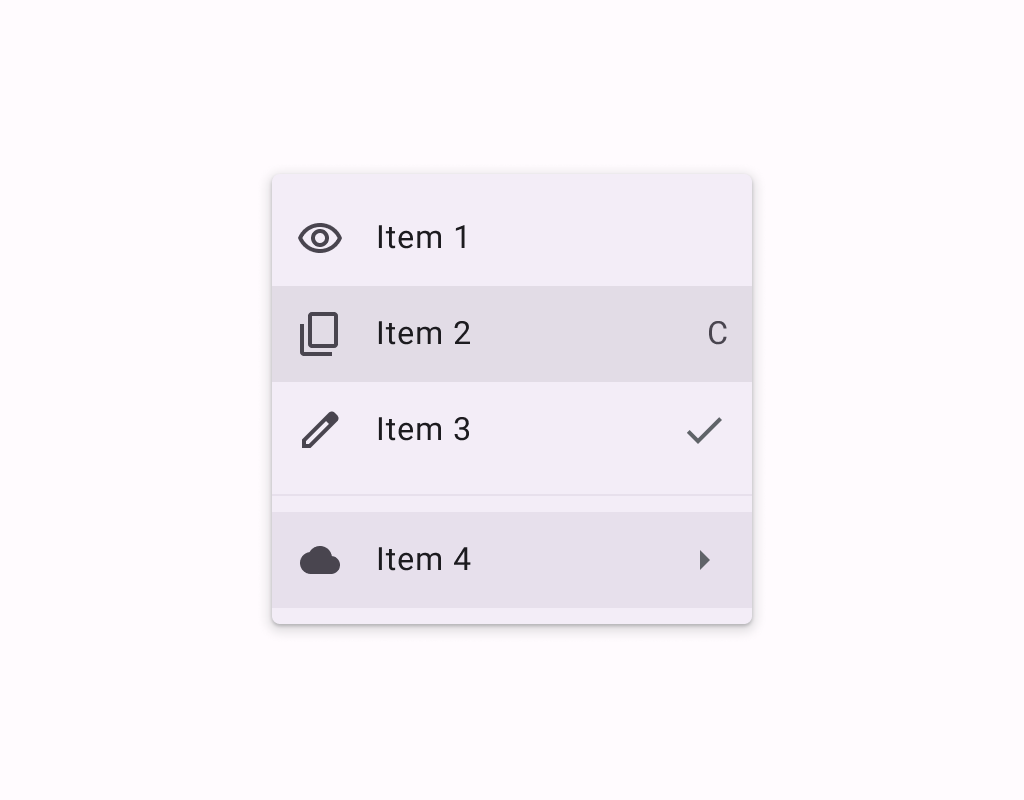
Menus display a list of choices on a temporary surface. They appear when users interact with a button, action, or other control.
Common
@Composable
expect fun DropdownMenu(
    expanded: Boolean,
    onDismissRequest: () -> Unit,
    modifier: Modifier = Modifier,
    offset: DpOffset = DpOffset(0.dp, 0.dp),
    scrollState: ScrollState = rememberScrollState(),
    properties: PopupProperties = DefaultMenuProperties,
    shape: Shape = MenuDefaults.shape,
    containerColor: Color = MenuDefaults.containerColor,
    tonalElevation: Dp = MenuDefaults.TonalElevation,
    shadowElevation: Dp = MenuDefaults.ShadowElevation,
    border: BorderStroke? = null,
    content: @Composable ColumnScope.() -> Unit,
)
Parameters
| expanded | whether the menu is expanded or not |
| onDismissRequest | called when the user requests to dismiss the menu, such as by tapping outside the menu's bounds |
| modifier | Modifier to be applied to the menu's content |
| offset | DpOffset from the original position of the menu. The offset respects the LayoutDirection, so the offset's x position will be added in LTR and subtracted in RTL. |
| scrollState | a ScrollState to used by the menu's content for items vertical scrolling |
| properties | PopupProperties for further customization of this popup's behavior |
| shape | the shape of the menu |
| containerColor | the container color of the menu |
| tonalElevation | when containerColor is ColorScheme.surface, a translucent primary color overlay is applied on top of the container. A higher tonal elevation value will result in a darker color in light theme and lighter color in dark theme. See also: Surface. |
| shadowElevation | the elevation for the shadow below the menu |
| border | the border to draw around the container of the menu. Pass null for no border. |
| content | the content of this dropdown menu, typically a DropdownMenuItem |
Android
@Composable
actual fun DropdownMenu(
    expanded: Boolean,
    onDismissRequest: () -> Unit,
    modifier: Modifier,
    offset: DpOffset,
    scrollState: ScrollState,
    properties: PopupProperties,
    shape: Shape,
    containerColor: Color,
    tonalElevation: Dp,
    shadowElevation: Dp,
    border: BorderStroke?,
    content: @Composable ColumnScope.() -> Unit,
)
Android
Deprecated Maintained for binary compatibility. Use overload with parameters for shape, color, elevation, and border.
@Composable
fun DropdownMenu(
    expanded: Boolean,
    onDismissRequest: () -> Unit,
    modifier: Modifier = Modifier,
    offset: DpOffset = DpOffset(0.dp, 0.dp),
    scrollState: ScrollState = rememberScrollState(),
    properties: PopupProperties = PopupProperties(focusable = true),
    content: @Composable ColumnScope.() -> Unit,
) =
    DropdownMenu(
        expanded = expanded,
        onDismissRequest = onDismissRequest,
        modifier = modifier,
        offset = offset,
        scrollState = scrollState,
        properties = properties,
        shape = MenuDefaults.shape,
        containerColor = MenuDefaults.containerColor,
        tonalElevation = MenuDefaults.TonalElevation,
        shadowElevation = MenuDefaults.ShadowElevation,
        border = null,
        content = content,
    )
Android
Deprecated Replaced by a DropdownMenu function with a ScrollState parameter
@Composable
fun DropdownMenu(
    expanded: Boolean,
    onDismissRequest: () -> Unit,
    modifier: Modifier = Modifier,
    offset: DpOffset = DpOffset(0.dp, 0.dp),
    properties: PopupProperties = PopupProperties(focusable = true),
    content: @Composable ColumnScope.() -> Unit,
) =
    DropdownMenu(
        expanded = expanded,
        onDismissRequest = onDismissRequest,
        modifier = modifier,
        offset = offset,
        scrollState = rememberScrollState(),
        properties = properties,
        content = content,
    )
Code Examples
MenuSample
@Preview
@Composable
fun MenuSample() {
    var expanded by remember { mutableStateOf(false) }
    Box(modifier = Modifier.fillMaxSize().wrapContentSize(Alignment.TopStart)) {
        IconButton(onClick = { expanded = true }) {
            Icon(Icons.Default.MoreVert, contentDescription = "Localized description")
        }
        DropdownMenu(expanded = expanded, onDismissRequest = { expanded = false }) {
            DropdownMenuItem(
                text = { Text("Edit") },
                onClick = { /* Handle edit! */ },
                leadingIcon = { Icon(Icons.Outlined.Edit, contentDescription = null) },
            )
            DropdownMenuItem(
                text = { Text("Settings") },
                onClick = { /* Handle settings! */ },
                leadingIcon = { Icon(Icons.Outlined.Settings, contentDescription = null) },
            )
            HorizontalDivider()
            DropdownMenuItem(
                text = { Text("Send Feedback") },
                onClick = { /* Handle send feedback! */ },
                leadingIcon = { Icon(Icons.Outlined.Email, contentDescription = null) },
                trailingIcon = { Text("F11", textAlign = TextAlign.Center) },
            )
        }
    }
}
MenuWithScrollStateSample
@Preview
@Composable
fun MenuWithScrollStateSample() {
    var expanded by remember { mutableStateOf(false) }
    val scrollState = rememberScrollState()
    Box(modifier = Modifier.fillMaxSize().wrapContentSize(Alignment.TopStart)) {
        IconButton(onClick = { expanded = true }) {
            Icon(Icons.Default.MoreVert, contentDescription = "Localized description")
        }
        DropdownMenu(
            expanded = expanded,
            onDismissRequest = { expanded = false },
            scrollState = scrollState,
        ) {
            repeat(30) {
                DropdownMenuItem(
                    text = { Text("Item ${it + 1}") },
                    onClick = { /* TODO */ },
                    leadingIcon = { Icon(Icons.Outlined.Edit, contentDescription = null) },
                )
            }
        }
        LaunchedEffect(expanded) {
            if (expanded) {
                // Scroll to show the bottom menu items.
                scrollState.scrollTo(scrollState.maxValue)
            }
        }
    }
}
