ListItem
Composable Component
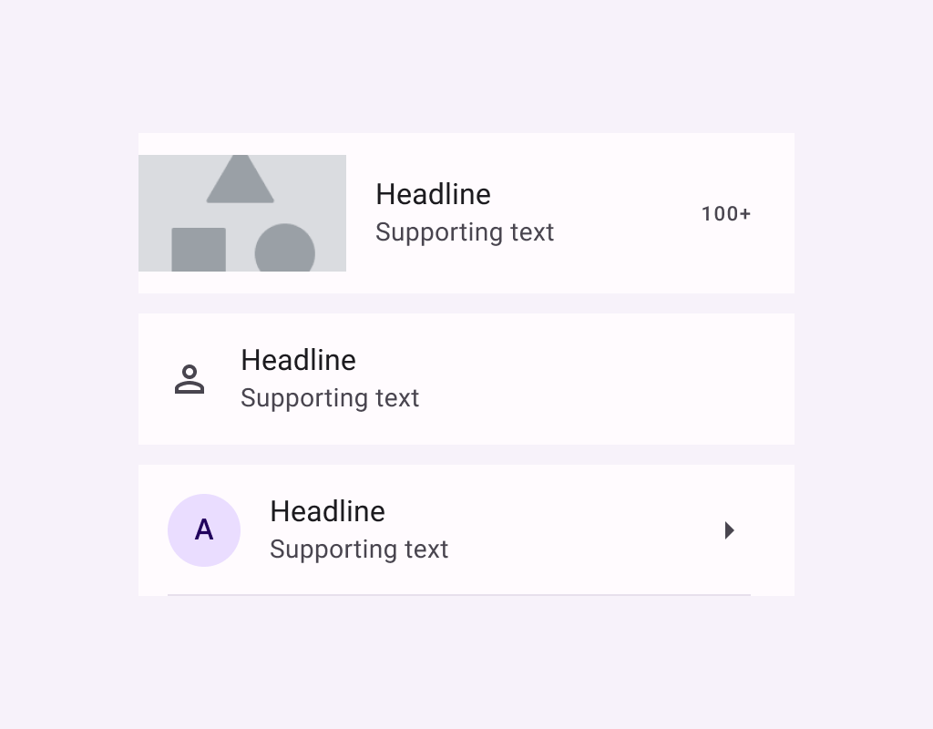
Lists are continuous, vertical indexes of text or images.
Common
@Composable
fun ListItem(
    headlineContent: @Composable () -> Unit,
    modifier: Modifier = Modifier,
    overlineContent: @Composable (() -> Unit)? = null,
    supportingContent: @Composable (() -> Unit)? = null,
    leadingContent: @Composable (() -> Unit)? = null,
    trailingContent: @Composable (() -> Unit)? = null,
    colors: ListItemColors = ListItemDefaults.colors(),
    tonalElevation: Dp = ListItemDefaults.Elevation,
    shadowElevation: Dp = ListItemDefaults.Elevation,
)
Parameters
| headlineContent | the headline content of the list item |
| modifier | Modifier to be applied to the list item |
| overlineContent | the content displayed above the headline content |
| supportingContent | the supporting content of the list item |
| leadingContent | the leading content of the list item |
| trailingContent | the trailing meta text, icon, switch or checkbox |
| colors | ListItemColors that will be used to resolve the background and content color for this list item in different states. See ListItemDefaults.colors |
| tonalElevation | the tonal elevation of this list item |
| shadowElevation | the shadow elevation of this list item |
Code Examples
OneLineListItem
@Preview
@Composable
fun OneLineListItem() {
    Column {
        HorizontalDivider()
        ListItem(
            headlineContent = { Text("One line list item with 24x24 icon") },
            leadingContent = {
                Icon(Icons.Filled.Favorite, contentDescription = "Localized description")
            },
        )
        HorizontalDivider()
    }
}
TwoLineListItem
@Preview
@Composable
fun TwoLineListItem() {
    Column {
        HorizontalDivider()
        ListItem(
            headlineContent = { Text("Two line list item with trailing") },
            supportingContent = { Text("Secondary text") },
            trailingContent = { Text("meta") },
            leadingContent = {
                Icon(Icons.Filled.Favorite, contentDescription = "Localized description")
            },
        )
        HorizontalDivider()
    }
}
ThreeLineListItemWithOverlineAndSupporting
@Preview
@Composable
fun ThreeLineListItemWithOverlineAndSupporting() {
    Column {
        HorizontalDivider()
        ListItem(
            headlineContent = { Text("Three line list item") },
            overlineContent = { Text("OVERLINE") },
            supportingContent = { Text("Secondary text") },
            leadingContent = {
                Icon(Icons.Filled.Favorite, contentDescription = "Localized description")
            },
            trailingContent = { Text("meta") },
        )
        HorizontalDivider()
    }
}
ThreeLineListItemWithExtendedSupporting
@Preview
@Composable
fun ThreeLineListItemWithExtendedSupporting() {
    Column {
        HorizontalDivider()
        ListItem(
            headlineContent = { Text("Three line list item") },
            supportingContent = { Text("Secondary text that\nspans multiple lines") },
            leadingContent = {
                Icon(Icons.Filled.Favorite, contentDescription = "Localized description")
            },
            trailingContent = { Text("meta") },
        )
        HorizontalDivider()
    }
}
