BadgedBox
Composable Component
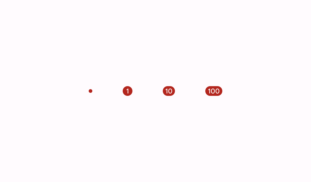
Material Design badge box.
Common
@Composable
fun BadgedBox(
    badge: @Composable BoxScope.() -> Unit,
    modifier: Modifier = Modifier,
    content: @Composable BoxScope.() -> Unit,
)
Parameters
| badge | the badge to be displayed - typically a Badge |
| modifier | the Modifier to be applied to this BadgedBox |
| content | the anchor to which this badge will be positioned |
Code Examples
NavigationBarItemWithBadge
@Preview
@Composable
fun NavigationBarItemWithBadge() {
    NavigationBar {
        NavigationBarItem(
            icon = {
                BadgedBox(
                    badge = {
                        Badge(
                            modifier =
                                Modifier.semantics { contentDescription = "New notification" }
                        )
                    }
                ) {
                    Icon(Icons.Filled.Star, contentDescription = "Favorite")
                }
            },
            selected = false,
            onClick = {},
        )
        NavigationBarItem(
            icon = {
                BadgedBox(
                    badge = {
                        Badge {
                            val badgeNumber = "8"
                            Text(
                                badgeNumber,
                                modifier =
                                    Modifier.semantics {
                                        contentDescription = "$badgeNumber new notifications"
                                    },
                            )
                        }
                    }
                ) {
                    Icon(Icons.Filled.Star, contentDescription = "Favorite")
                }
            },
            selected = false,
            onClick = {},
        )
        NavigationBarItem(
            icon = {
                BadgedBox(
                    badge = {
                        Badge {
                            val badgeNumber = "999+"
                            Text(
                                badgeNumber,
                                modifier =
                                    Modifier.semantics {
                                        contentDescription = "$badgeNumber new notifications"
                                    },
                            )
                        }
                    }
                ) {
                    Icon(Icons.Filled.Star, contentDescription = "Favorite")
                }
            },
            selected = false,
            onClick = {},
        )
    }
}
