ElevatedFilterChip
Composable Component
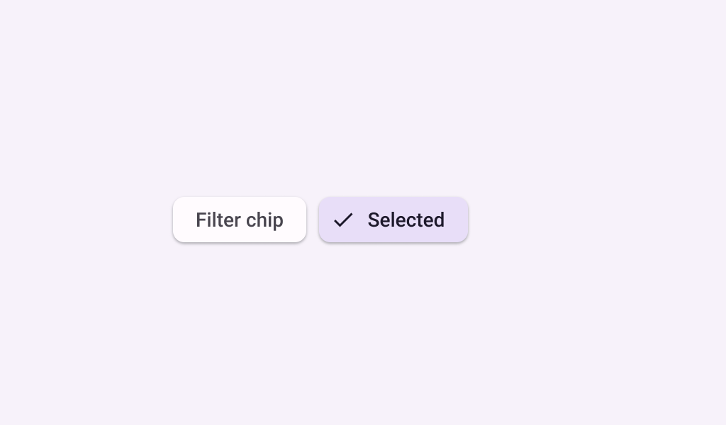
Chips help people enter information, make selections, filter content, or trigger actions. Chips can show multiple interactive elements together in the same area, such as a list of selectable movie times, or a series of email contacts.
Common
@Composable
fun ElevatedFilterChip(
    selected: Boolean,
    onClick: () -> Unit,
    label: @Composable () -> Unit,
    modifier: Modifier = Modifier,
    enabled: Boolean = true,
    leadingIcon: @Composable (() -> Unit)? = null,
    trailingIcon: @Composable (() -> Unit)? = null,
    shape: Shape = FilterChipDefaults.shape,
    colors: SelectableChipColors = FilterChipDefaults.elevatedFilterChipColors(),
    elevation: SelectableChipElevation? = FilterChipDefaults.elevatedFilterChipElevation(),
    border: BorderStroke? = null,
    interactionSource: MutableInteractionSource? = null,
) =
    SelectableChip(
        selected = selected,
        modifier = modifier,
        onClick = onClick,
        enabled = enabled,
        label = label,
        labelTextStyle = FilterChipTokens.LabelTextFont.value,
        leadingIcon = leadingIcon,
        avatar = null,
        trailingIcon = trailingIcon,
        elevation = elevation,
        colors = colors,
        minHeight = FilterChipDefaults.Height,
        paddingValues = FilterChipPadding,
        shape = shape,
        border = border,
        interactionSource = interactionSource,
    )
Parameters
| selected | whether this chip is selected or not |
| onClick | called when this chip is clicked |
| label | text label for this chip |
| modifier | the Modifier to be applied to this chip |
| enabled | controls the enabled state of this chip. When false, this component will not respond to user input, and it will appear visually disabled and disabled to accessibility services. |
| leadingIcon | optional icon at the start of the chip, preceding the label text. When selected is true, this icon may visually indicate that the chip is selected (for example, via a checkmark icon). |
| trailingIcon | optional icon at the end of the chip |
| shape | defines the shape of this chip's container, border (when border is not null), and shadow (when using elevation) |
| colors | SelectableChipColors that will be used to resolve the colors used for this chip in different states. See FilterChipDefaults.elevatedFilterChipColors. |
| elevation | SelectableChipElevation used to resolve the elevation for this chip in different states. This controls the size of the shadow below the chip. Additionally, when the container color is ColorScheme.surface, this controls the amount of primary color applied as an overlay. See FilterChipDefaults.filterChipElevation. |
| border | the border to draw around the container of this chip. Pass null for no border. See FilterChipDefaults.filterChipBorder. |
| interactionSource | an optional hoisted MutableInteractionSource for observing and emitting Interactions for this chip. You can use this to change the chip's appearance or preview the chip in different states. Note that if null is provided, interactions will still happen internally. |
Code Examples
ElevatedFilterChipSample
@Preview
@Composable
fun ElevatedFilterChipSample() {
    var selected by remember { mutableStateOf(false) }
    ElevatedFilterChip(
        selected = selected,
        onClick = { selected = !selected },
        label = { Text("Filter chip") },
        leadingIcon =
            if (selected) {
                {
                    Icon(
                        imageVector = Icons.Filled.Done,
                        contentDescription = "Localized Description",
                        modifier = Modifier.size(FilterChipDefaults.IconSize),
                    )
                }
            } else {
                null
            },
    )
}
