ModalBottomSheet
Composable Component
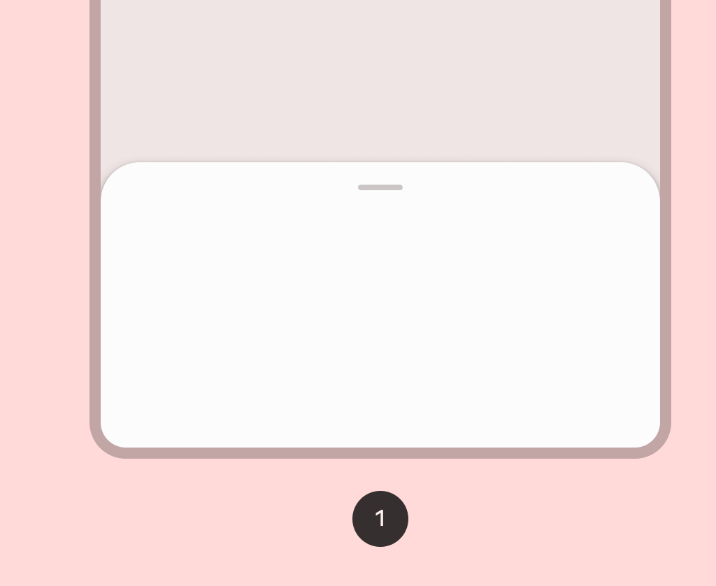
Modal bottom sheets are used as an alternative to inline menus or simple dialogs on mobile, especially when offering a long list of action items, or when items require longer descriptions and icons. Like dialogs, modal bottom sheets appear in front of app content, disabling all other app functionality when they appear, and remaining on screen until confirmed, dismissed, or a required action has been taken.
Common
@Composable
@ExperimentalMaterial3Api
fun ModalBottomSheet(
    onDismissRequest: () -> Unit,
    modifier: Modifier = Modifier,
    sheetState: SheetState = rememberModalBottomSheetState(),
    sheetMaxWidth: Dp = BottomSheetDefaults.SheetMaxWidth,
    sheetGesturesEnabled: Boolean = true,
    shape: Shape = BottomSheetDefaults.ExpandedShape,
    containerColor: Color = BottomSheetDefaults.ContainerColor,
    contentColor: Color = contentColorFor(containerColor),
    tonalElevation: Dp = 0.dp,
    scrimColor: Color = BottomSheetDefaults.ScrimColor,
    dragHandle: @Composable (() -> Unit)? = { BottomSheetDefaults.DragHandle() },
    contentWindowInsets: @Composable () -> WindowInsets = { BottomSheetDefaults.windowInsets },
    properties: ModalBottomSheetProperties = ModalBottomSheetProperties(),
    content: @Composable ColumnScope.() -> Unit,
)
Parameters
| onDismissRequest | Executes when the user clicks outside of the bottom sheet, after sheet animates to Hidden. |
| modifier | Optional Modifier for the bottom sheet. |
| sheetState | The state of the bottom sheet. |
| sheetMaxWidth | Dp that defines what the maximum width the sheet will take. Pass in Dp.Unspecified for a sheet that spans the entire screen width. |
| sheetGesturesEnabled | Whether the bottom sheet can be interacted with by gestures. |
| shape | The shape of the bottom sheet. |
| containerColor | The color used for the background of this bottom sheet |
| contentColor | The preferred color for content inside this bottom sheet. Defaults to either the matching content color for containerColor, or to the current LocalContentColor if containerColor is not a color from the theme. |
| tonalElevation | when containerColor is ColorScheme.surface, a translucent primary color overlay is applied on top of the container. A higher tonal elevation value will result in a darker color in light theme and lighter color in dark theme. See also: Surface. |
| scrimColor | Color of the scrim that obscures content when the bottom sheet is open. |
| dragHandle | Optional visual marker to swipe the bottom sheet. |
| contentWindowInsets | callback which provides window insets to be passed to the bottom sheet content via Modifier.windowInsetsPadding. ModalBottomSheet will pre-emptively consume top insets based on it's current offset. This keeps content outside of the expected window insets at any position. |
| properties | ModalBottomSheetProperties for further customization of this modal bottom sheet's window behavior. |
| content | The content to be displayed inside the bottom sheet. |
Common
Deprecated Maintained for Binary compatibility. Use overload with sheetGesturesEnabled param.
@Composable
@ExperimentalMaterial3Api
fun ModalBottomSheet(
    onDismissRequest: () -> Unit,
    modifier: Modifier = Modifier,
    sheetState: SheetState = rememberModalBottomSheetState(),
    sheetMaxWidth: Dp = BottomSheetDefaults.SheetMaxWidth,
    shape: Shape = BottomSheetDefaults.ExpandedShape,
    containerColor: Color = BottomSheetDefaults.ContainerColor,
    contentColor: Color = contentColorFor(containerColor),
    tonalElevation: Dp = 0.dp,
    scrimColor: Color = BottomSheetDefaults.ScrimColor,
    dragHandle: @Composable (() -> Unit)? = { BottomSheetDefaults.DragHandle() },
    contentWindowInsets: @Composable () -> WindowInsets = { BottomSheetDefaults.windowInsets },
    properties: ModalBottomSheetProperties = ModalBottomSheetDefaults.properties,
    content: @Composable ColumnScope.() -> Unit,
) =
    ModalBottomSheet(
        onDismissRequest = onDismissRequest,
        modifier = modifier,
        sheetState = sheetState,
        sheetMaxWidth = sheetMaxWidth,
        sheetGesturesEnabled = true,
        shape = shape,
        containerColor = containerColor,
        contentColor = contentColor,
        tonalElevation = tonalElevation,
        scrimColor = scrimColor,
        dragHandle = dragHandle,
        contentWindowInsets = contentWindowInsets,
        properties = properties,
        content = content,
    )
Android
Deprecated Use constructor with contentWindowInsets parameter.
@Composable
@ExperimentalMaterial3Api
fun ModalBottomSheet(
    onDismissRequest: () -> Unit,
    modifier: Modifier = Modifier,
    sheetState: SheetState = rememberModalBottomSheetState(),
    sheetMaxWidth: Dp = BottomSheetDefaults.SheetMaxWidth,
    shape: Shape = BottomSheetDefaults.ExpandedShape,
    containerColor: Color = BottomSheetDefaults.ContainerColor,
    contentColor: Color = contentColorFor(containerColor),
    tonalElevation: Dp = 0.dp,
    scrimColor: Color = BottomSheetDefaults.ScrimColor,
    dragHandle: @Composable (() -> Unit)? = { BottomSheetDefaults.DragHandle() },
    windowInsets: WindowInsets = BottomSheetDefaults.windowInsets,
    properties: ModalBottomSheetProperties = ModalBottomSheetDefaults.properties,
    content: @Composable ColumnScope.() -> Unit,
) =
    ModalBottomSheet(
        onDismissRequest = onDismissRequest,
        modifier = modifier,
        sheetState = sheetState,
        sheetMaxWidth = sheetMaxWidth,
        shape = shape,
        containerColor = containerColor,
        contentColor = contentColor,
        tonalElevation = tonalElevation,
        scrimColor = scrimColor,
        dragHandle = dragHandle,
        contentWindowInsets = { windowInsets },
        properties = properties,
        content = content,
    )
Parameters
| onDismissRequest | Executes when the user clicks outside of the bottom sheet, after sheet animates to Hidden. |
| modifier | Optional Modifier for the bottom sheet. |
| sheetState | The state of the bottom sheet. |
| sheetMaxWidth | Dp that defines what the maximum width the sheet will take. Pass in Dp.Unspecified for a sheet that spans the entire screen width. |
| shape | The shape of the bottom sheet. |
| containerColor | The color used for the background of this bottom sheet |
| contentColor | The preferred color for content inside this bottom sheet. Defaults to either the matching content color for containerColor, or to the current LocalContentColor if containerColor is not a color from the theme. |
| tonalElevation | when containerColor is ColorScheme.surface, a translucent primary color overlay is applied on top of the container. A higher tonal elevation value will result in a darker color in light theme and lighter color in dark theme. See also: Surface. |
| scrimColor | Color of the scrim that obscures content when the bottom sheet is open. |
| dragHandle | Optional visual marker to swipe the bottom sheet. |
| windowInsets | window insets to be passed to the bottom sheet content via PaddingValues params. |
| properties | ModalBottomSheetProperties for further customization of this modal bottom sheet's window behavior. |
| content | The content to be displayed inside the bottom sheet. |
Code Examples
ModalBottomSheetSample
@Preview
@OptIn(ExperimentalMaterial3Api::class)
@Composable
fun ModalBottomSheetSample() {
    var openBottomSheet by rememberSaveable { mutableStateOf(false) }
    var skipPartiallyExpanded by rememberSaveable { mutableStateOf(false) }
    val scope = rememberCoroutineScope()
    val bottomSheetState =
        rememberModalBottomSheetState(skipPartiallyExpanded = skipPartiallyExpanded)
    // App content
    Column(
        horizontalAlignment = Alignment.Start,
        verticalArrangement = Arrangement.spacedBy(4.dp),
    ) {
        Row(
            Modifier.toggleable(
                value = skipPartiallyExpanded,
                role = Role.Checkbox,
                onValueChange = { checked -> skipPartiallyExpanded = checked },
            )
        ) {
            Checkbox(checked = skipPartiallyExpanded, onCheckedChange = null)
            Spacer(Modifier.width(16.dp))
            Text("Skip partially expanded State")
        }
        Button(
            onClick = { openBottomSheet = !openBottomSheet },
            modifier = Modifier.align(Alignment.CenterHorizontally),
        ) {
            Text(text = "Show Bottom Sheet")
        }
    }
    // Sheet content
    if (openBottomSheet) {
        ModalBottomSheet(
            onDismissRequest = { openBottomSheet = false },
            sheetState = bottomSheetState,
        ) {
            Row(Modifier.fillMaxWidth(), horizontalArrangement = Arrangement.Center) {
                Button(
                    // Note: If you provide logic outside of onDismissRequest to remove the sheet,
                    // you must additionally handle intended state cleanup, if any.
                    onClick = {
                        scope
                            .launch { bottomSheetState.hide() }
                            .invokeOnCompletion {
                                if (!bottomSheetState.isVisible) {
                                    openBottomSheet = false
                                }
                            }
                    }
                ) {
                    Text("Hide Bottom Sheet")
                }
            }
            var text by remember { mutableStateOf("") }
            OutlinedTextField(
                value = text,
                onValueChange = { text = it },
                modifier = Modifier.padding(horizontal = 16.dp),
                label = { Text("Text field") },
            )
            LazyColumn {
                items(25) {
                    ListItem(
                        headlineContent = { Text("Item $it") },
                        leadingContent = {
                            Icon(
                                Icons.Default.Favorite,
                                contentDescription = "Localized description",
                            )
                        },
                        colors =
                            ListItemDefaults.colors(
                                containerColor = MaterialTheme.colorScheme.surfaceContainerLow
                            ),
                    )
                }
            }
        }
    }
}
