NavigationBar
Composable Component
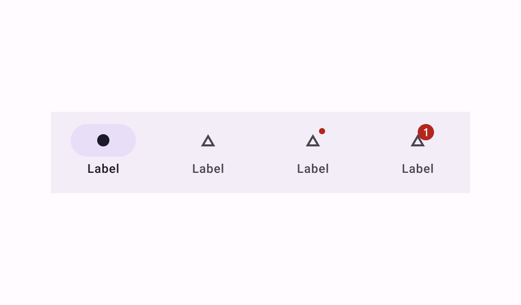
Navigation bars offer a persistent and convenient way to switch between primary destinations in an app.
Common
@Composable
fun NavigationBar(
    modifier: Modifier = Modifier,
    containerColor: Color = NavigationBarDefaults.containerColor,
    contentColor: Color = MaterialTheme.colorScheme.contentColorFor(containerColor),
    tonalElevation: Dp = NavigationBarDefaults.Elevation,
    windowInsets: WindowInsets = NavigationBarDefaults.windowInsets,
    content: @Composable RowScope.() -> Unit,
)
Parameters
| modifier | the Modifier to be applied to this navigation bar |
| containerColor | the color used for the background of this navigation bar. Use Color.Transparent to have no color. |
| contentColor | the preferred color for content inside this navigation bar. Defaults to either the matching content color for containerColor, or to the current LocalContentColor if containerColor is not a color from the theme. |
| tonalElevation | when containerColor is ColorScheme.surface, a translucent primary color overlay is applied on top of the container. A higher tonal elevation value will result in a darker color in light theme and lighter color in dark theme. See also: Surface. |
| windowInsets | a window insets of the navigation bar. |
| content | the content of this navigation bar, typically 3-5 NavigationBarItems |
Code Examples
NavigationBarSample
@Preview
@Composable
fun NavigationBarSample() {
    var selectedItem by remember { mutableIntStateOf(0) }
    val items = listOf("Songs", "Artists", "Playlists")
    val selectedIcons = listOf(Icons.Filled.Home, Icons.Filled.Favorite, Icons.Filled.Star)
    val unselectedIcons =
        listOf(Icons.Outlined.Home, Icons.Outlined.FavoriteBorder, Icons.Outlined.StarBorder)
    NavigationBar {
        items.forEachIndexed { index, item ->
            NavigationBarItem(
                icon = {
                    Icon(
                        if (selectedItem == index) selectedIcons[index] else unselectedIcons[index],
                        contentDescription = item,
                    )
                },
                label = { Text(item) },
                selected = selectedItem == index,
                onClick = { selectedItem = index },
            )
        }
    }
}
