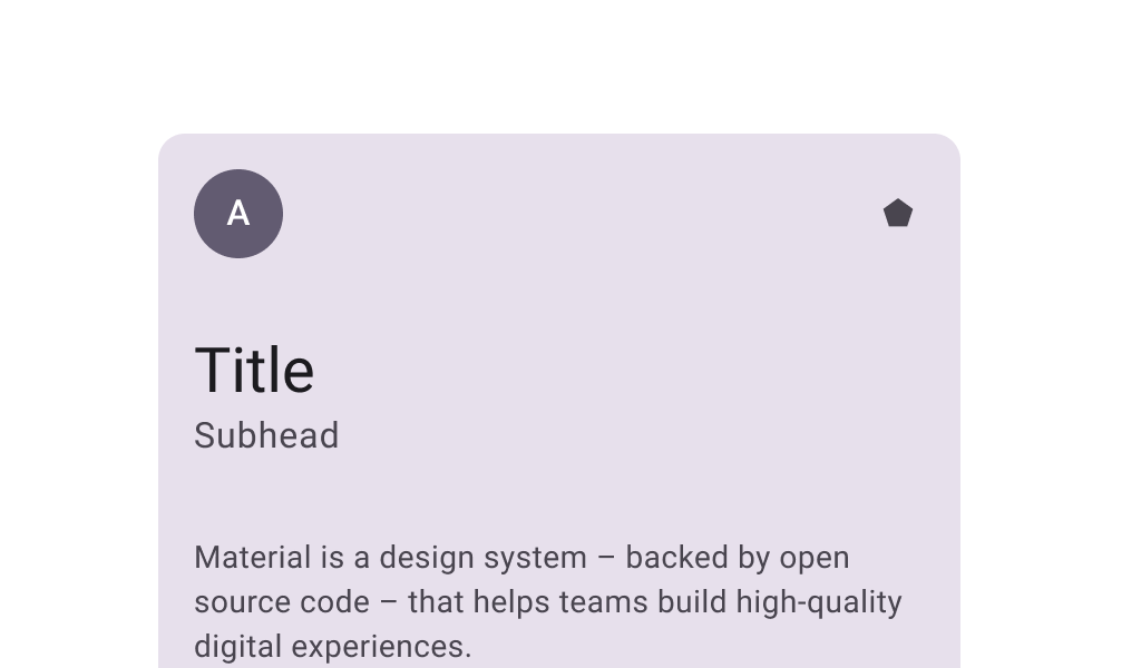


CardSample
@Preview
@Sampled
@Composable
fun CardSample() {
    Card(Modifier.size(width = 180.dp, height = 100.dp)) {
        Box(Modifier.fillMaxSize()) { Text("Card content", Modifier.align(Alignment.Center)) }
    }
}
ClickableCardSample
@Preview
@Sampled
@Composable
fun ClickableCardSample() {
    Card(
        onClick = { /* Do something */ },
        modifier = Modifier.size(width = 180.dp, height = 100.dp),
    ) {
        Box(Modifier.fillMaxSize()) { Text("Clickable", Modifier.align(Alignment.Center)) }
    }
}