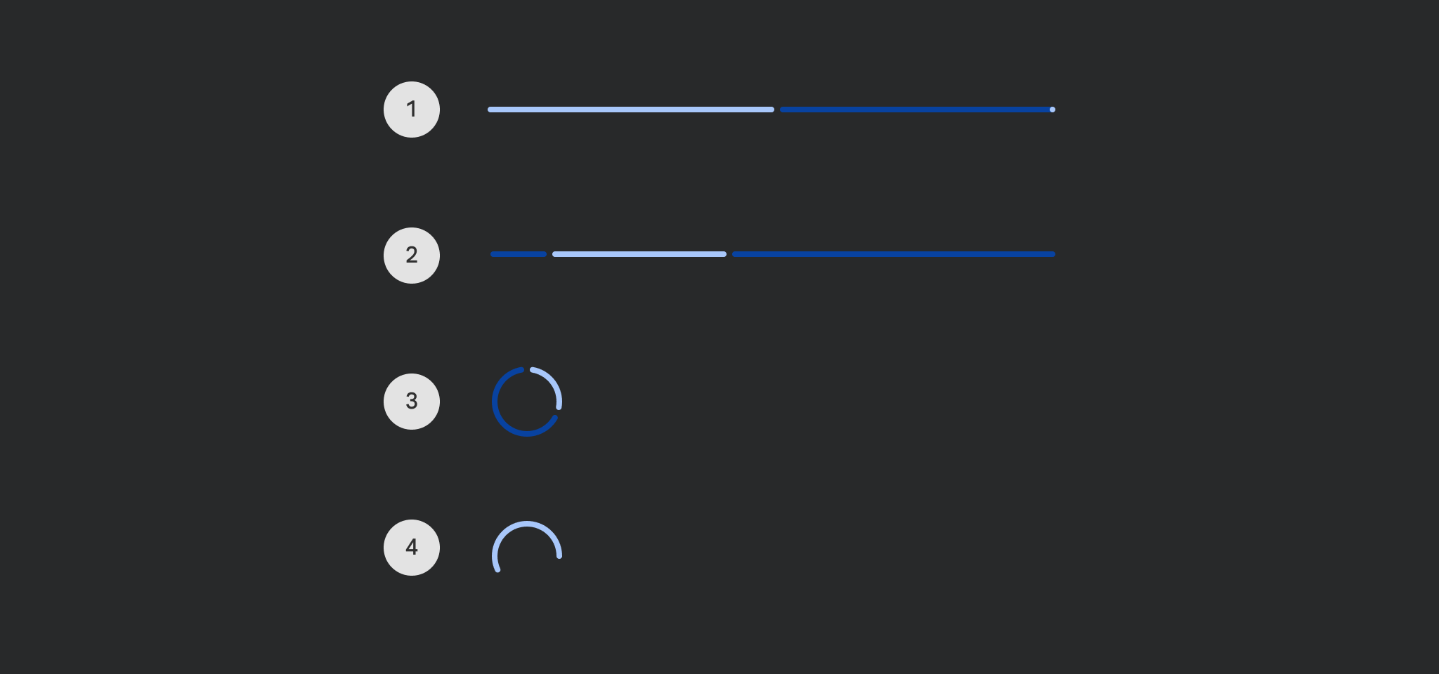
Material Design determinate circular progress indicator Progress indicators express an unspecified wait time or display the duration of a process.
CircularProgressIndicatorSample
@Preview
@Sampled
@Composable
fun CircularProgressIndicatorSample() {
    val sliderState = rememberSliderState(0.1f)
    val animatedProgress by
        animateFloatAsState(
            targetValue = sliderState.value,
            animationSpec = ProgressIndicatorDefaults.ProgressAnimationSpec,
        )

    Column(horizontalAlignment = Alignment.CenterHorizontally) {
        CircularProgressIndicator(progress = { animatedProgress })
        Spacer(Modifier.requiredHeight(30.dp))
        Text("Set progress:")
        Slider(
            state = sliderState,
            onValueChange = { sliderState.value = it },
            modifier = Modifier.width(300.dp),
        )
    }
}
IndeterminateCircularProgressIndicatorSample
@Preview
@Sampled
@Composable
fun IndeterminateCircularProgressIndicatorSample() {
    Column(horizontalAlignment = Alignment.CenterHorizontally) { CircularProgressIndicator() }
}