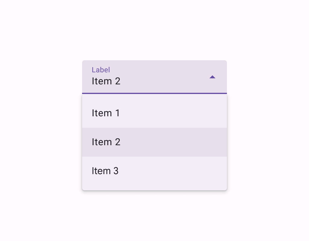
Material Design exposed dropdown menu Menus display a list of choices on a temporary surface.
@OptIn(ExperimentalMaterial3ExpressiveApi::class)
@Preview
@Sampled
@Composable
fun ExposedDropdownMenuSample() {
    val options: List<String> = SampleData.take(5)
    var expanded by remember { mutableStateOf(false) }
    val textFieldState = rememberTextFieldState(options[0])
    var checkedIndex by rememberSaveable { mutableIntStateOf(0) }

    ExposedDropdownMenuBox(expanded = expanded, onExpandedChange = { expanded = it }) {
        TextField(
            // The `menuAnchor` modifier must be passed to the text field to handle
            // expanding/collapsing the menu on click. A read-only text field has
            // the anchor type `PrimaryNotEditable`.
            modifier = Modifier.menuAnchor(ExposedDropdownMenuAnchorType.PrimaryNotEditable),
            state = textFieldState,
            readOnly = true,
            lineLimits = TextFieldLineLimits.SingleLine,
            label = { Text("Label") },
            trailingIcon = { ExposedDropdownMenuDefaults.TrailingIcon(expanded = expanded) },
            colors = ExposedDropdownMenuDefaults.textFieldColors(),
        )
        ExposedDropdownMenu(
            expanded = expanded,
            onDismissRequest = { expanded = false },
            containerColor = MenuDefaults.groupStandardContainerColor,
            shape = MenuDefaults.standaloneGroupShape,
        ) {
            val optionCount = options.size
            options.forEachIndexed { index, option ->
                SelectableDropdownMenuItem(
                    shapes = MenuDefaults.itemShape(index, optionCount),
                    text = { Text(option, style = MaterialTheme.typography.bodyLarge) },
                    selected = index == checkedIndex,
                    onClick = {
                        textFieldState.setTextAndPlaceCursorAtEnd(option)
                        checkedIndex = index
                        expanded = false
                    },
                    selectedLeadingIcon = {
                        Icon(
                            Icons.Filled.Check,
                            modifier = Modifier.size(MenuDefaults.LeadingIconSize),
                            contentDescription = null,
                        )
                    },
                    contentPadding = ExposedDropdownMenuDefaults.ItemContentPadding,
                )
            }
        }
    }
}
@Preview
@Sampled
@Composable
fun EditableExposedDropdownMenuSample() {
    val options: List<String> = SampleData
    val textFieldState = rememberTextFieldState()

    // The text that the user inputs into the text field can be used to filter the options.
    // This sample uses string subsequence matching.
    val filteredOptions = options.filteredBy(textFieldState.text)

    val (allowExpanded, setExpanded) = remember { mutableStateOf(false) }
    val expanded = allowExpanded && filteredOptions.isNotEmpty()

    ExposedDropdownMenuBox(expanded = expanded, onExpandedChange = setExpanded) {
        TextField(
            // The `menuAnchor` modifier must be passed to the text field to handle
            // expanding/collapsing the menu on click. An editable text field has
            // the anchor type `PrimaryEditable`.
            modifier =
                Modifier.width(TextFieldDefaults.MinWidth)
                    .menuAnchor(ExposedDropdownMenuAnchorType.PrimaryEditable),
            state = textFieldState,
            lineLimits = TextFieldLineLimits.SingleLine,
            label = { Text("Label") },
            trailingIcon = {
                ExposedDropdownMenuDefaults.TrailingIcon(
                    expanded = expanded,
                    // If the text field is editable, it is recommended to make the
                    // trailing icon a `menuAnchor` of type `SecondaryEditable`. This
                    // provides a better experience for certain accessibility services
                    // to choose a menu option without typing.
                    modifier = Modifier.menuAnchor(ExposedDropdownMenuAnchorType.SecondaryEditable),
                )
            },
            colors = ExposedDropdownMenuDefaults.textFieldColors(),
        )
        ExposedDropdownMenu(
            modifier = Modifier.heightIn(max = 280.dp),
            expanded = expanded,
            onDismissRequest = { setExpanded(false) },
        ) {
            filteredOptions.forEach { option ->
                DropdownMenuItem(
                    text = { Text(option, style = MaterialTheme.typography.bodyLarge) },
                    onClick = {
                        textFieldState.setTextAndPlaceCursorAtEnd(option.text)
                        setExpanded(false)
                    },
                    contentPadding = ExposedDropdownMenuDefaults.ItemContentPadding,
                )
            }
        }
    }
}
@Preview
@Sampled
@Composable
fun MultiAutocompleteExposedDropdownMenuSample() {
    /**
     * Returns the TextRange of the current token around the cursor, where commas define token
     * boundaries.
     */