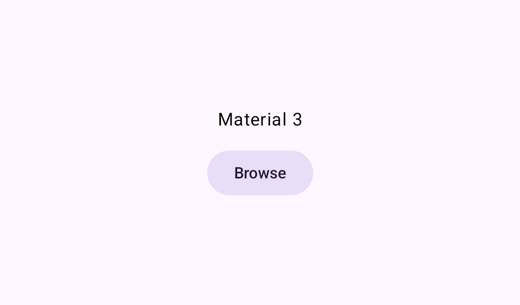
Material Theming refers to the customization of your Material Design app to better reflect your product’s brand.
MaterialThemeSample
@Preview
@Composable
fun MaterialThemeSample() {
    val isDarkTheme = isSystemInDarkTheme()
    val supportsDynamicColor = Build.VERSION.SDK_INT >= Build.VERSION_CODES.S
    val lightColorScheme = lightColorScheme(primary = Color(0xFF1EB980))
    val darkColorScheme = darkColorScheme(primary = Color(0xFF66ffc7))
    val colorScheme =
        when {
            supportsDynamicColor && isDarkTheme -> {
                dynamicDarkColorScheme(LocalContext.current)
            }
            supportsDynamicColor && !isDarkTheme -> {
                dynamicLightColorScheme(LocalContext.current)
            }
            isDarkTheme -> darkColorScheme
            else -> lightColorScheme
        }
    val typography =
        Typography(
            displaySmall = TextStyle(fontWeight = FontWeight.W100, fontSize = 96.sp),
            labelLarge = TextStyle(fontWeight = FontWeight.W600, fontSize = 14.sp),
        )
    val shapes = Shapes(extraSmall = RoundedCornerShape(3.0.dp), small = RoundedCornerShape(6.0.dp))
    MaterialTheme(colorScheme = colorScheme, typography = typography, shapes = shapes) {
        val currentTheme = if (!isSystemInDarkTheme()) "light" else "dark"
        ExtendedFloatingActionButton(
            text = { Text("FAB with text style and color from $currentTheme theme") },
            icon = { Icon(Icons.Filled.Favorite, contentDescription = "Localized Description") },
            onClick = {},
        )
    }
}