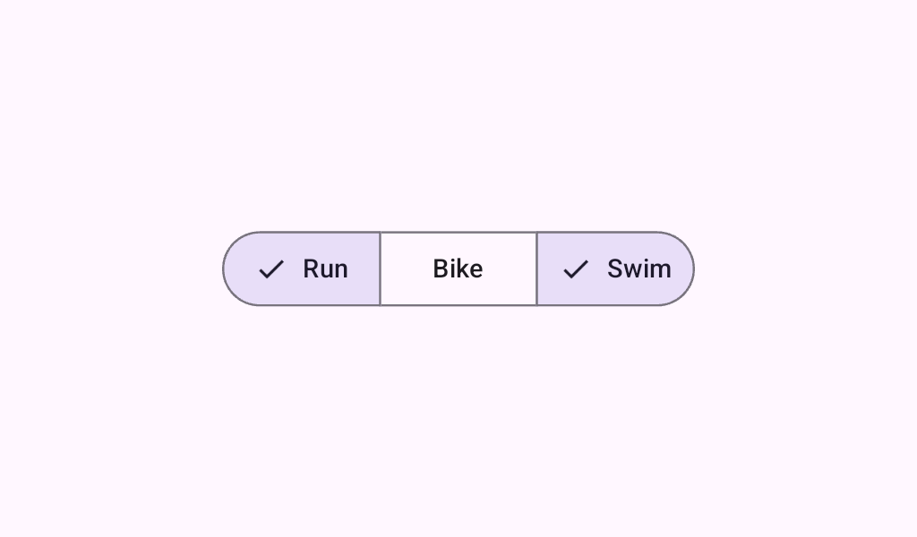
Material Design segmented button A Layout to correctly position, size, and add semantics to SegmentedButtons in a Row.
@Sampled
@Composable
@Preview
fun SegmentedButtonMultiSelectSample() {
    val checkedList = rememberSaveable { mutableStateListOf<Int>() }
    val options = listOf("Favorites", "Trending", "Saved")
    val icons =
        listOf(
            Icons.Filled.StarBorder,
            Icons.AutoMirrored.Filled.TrendingUp,
            Icons.Filled.BookmarkBorder,
        )
    MultiChoiceSegmentedButtonRow {
        options.forEachIndexed { index, label ->
            SegmentedButton(
                shape = SegmentedButtonDefaults.itemShape(index = index, count = options.size),
                icon = {
                    SegmentedButtonDefaults.Icon(active = index in checkedList) {
                        Icon(
                            imageVector = icons[index],
                            contentDescription = null,
                            modifier = Modifier.size(SegmentedButtonDefaults.IconSize),
                        )
                    }
                },
                onCheckedChange = {
                    if (index in checkedList) {
                        checkedList.remove(index)
                    } else {
                        checkedList.add(index)
                    }
                },
                checked = index in checkedList,
            ) {
                Text(label)
            }
        }
    }
}