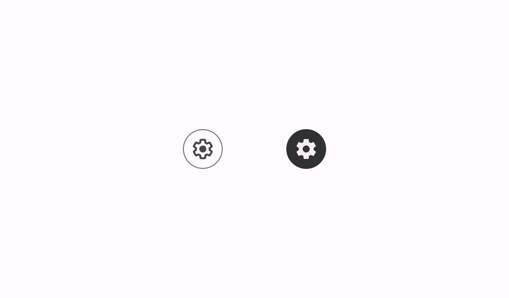
Material Design outlined icon toggle button Icon buttons help people take supplementary actions with a single tap.
@Preview
@Sampled
@Composable
fun OutlinedIconToggleButtonSample() {
    var checked by rememberSaveable { mutableStateOf(false) }
    val description = "Localized description"
    // Icon button should have a tooltip associated with it for a11y.
    TooltipBox(
        positionProvider =
            TooltipDefaults.rememberTooltipPositionProvider(TooltipAnchorPosition.Above),
        tooltip = {
            PlainTooltip(
                modifier =
                    Modifier.semantics {
                        // TODO(b/496338253): Remove this modifier once bug where tooltip text is
                        //  not announced by a11y screen readers is resolved.
                        liveRegion = LiveRegionMode.Assertive
                        paneTitle = description
                    }
            ) {
                Text(description)
            }
        },
        state = rememberTooltipState(),
    ) {
        OutlinedIconToggleButton(checked = checked, onCheckedChange = { checked = it }) {
            if (checked) {
                Icon(Icons.Filled.Lock, contentDescription = description)
            } else {
                Icon(Icons.Outlined.Lock, contentDescription = description)
            }
        }
    }
}
@Preview
@Sampled
@Composable
fun OutlinedIconToggleButtonWithAnimatedShapeSample() {
    var checked by rememberSaveable { mutableStateOf(false) }
    val description = "Localized description"
    // Icon button should have a tooltip associated with it for a11y.
    TooltipBox(
        positionProvider =
            TooltipDefaults.rememberTooltipPositionProvider(TooltipAnchorPosition.Above),
        tooltip = {
            PlainTooltip(
                modifier =
                    Modifier.semantics {
                        // TODO(b/496338253): Remove this modifier once bug where tooltip text is
                        //  not announced by a11y screen readers is resolved.
                        liveRegion = LiveRegionMode.Assertive
                        paneTitle = description
                    }
            ) {
                Text(description)
            }
        },
        state = rememberTooltipState(),
    ) {
        OutlinedIconToggleButton(
            checked = checked,
            onCheckedChange = { checked = it },
            shapes = IconButtonDefaults.toggleableShapes(),
        ) {
            if (checked) {
                Icon(Icons.Filled.Lock, contentDescription = description)
            } else {
                Icon(Icons.Outlined.Lock, contentDescription = description)
            }
        }
    }
}