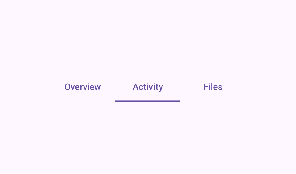
Material Design tabs Material Design fixed tabs.
TextTabs
@Preview
@Sampled
@Composable
@OptIn(ExperimentalMaterial3Api::class)
fun TextTabs() {
    var state by rememberSaveable { mutableStateOf(0) }
    val titles = listOf("Tab 1", "Tab 2", "Tab 3 with lots of text")
    Column {
        PrimaryTabRow(selectedTabIndex = state) {
            titles.forEachIndexed { index, title ->
                Tab(
                    selected = state == index,
                    onClick = { state = index },
                    text = { Text(text = title, maxLines = 2, overflow = TextOverflow.Ellipsis) },
                )
            }
        }
        Text(
            modifier = Modifier.align(Alignment.CenterHorizontally),
            text = "Text tab ${state + 1} selected",
            style = MaterialTheme.typography.bodyLarge,
        )
    }
}
FancyTabs
@Preview
@Sampled
@Composable
@OptIn(ExperimentalMaterial3Api::class)
fun FancyTabs() {
    var state by rememberSaveable { mutableStateOf(0) }
    val titles = listOf("Tab 1", "Tab 2", "Tab 3")
    Column {
        SecondaryTabRow(selectedTabIndex = state) {
            titles.forEachIndexed { index, title ->
                FancyTab(title = title, onClick = { state = index }, selected = (index == state))
            }
        }
        Text(
            modifier = Modifier.align(Alignment.CenterHorizontally),
            text = "Fancy tab ${state + 1} selected",
            style = MaterialTheme.typography.bodyLarge,
        )
    }
}
FancyTab
@Sampled
@Composable
fun FancyTab(title: String, onClick: () -> Unit, selected: Boolean) {
    Tab(selected, onClick) {
        Column(
            Modifier.padding(10.dp).height(50.dp).fillMaxWidth(),
            verticalArrangement = Arrangement.SpaceBetween,
        ) {
            Box(
                Modifier.size(10.dp)
                    .align(Alignment.CenterHorizontally)
                    .background(
                        color =
                            if (selected) MaterialTheme.colorScheme.primary
                            else MaterialTheme.colorScheme.background
                    )
            )
            Text(
                text = title,
                style = MaterialTheme.typography.bodyLarge,
                modifier = Modifier.align(Alignment.CenterHorizontally),
            )
        }
    }
}
FancyIndicator
@Sampled
@Composable
fun FancyIndicator(color: Color, modifier: Modifier = Modifier) {
    // Draws a rounded rectangular with border around the Tab, with a 5.dp padding from the edges
    // Color is passed in as a parameter [color]
    Box(
        modifier
            .padding(5.dp)
            .fillMaxSize()
            .border(BorderStroke(2.dp, color), RoundedCornerShape(5.dp))
    )
}
FancyIndicatorTabs
@Preview
@Sampled
@Composable
@OptIn(ExperimentalMaterial3Api::class)
fun FancyIndicatorTabs() {
    var state by rememberSaveable { mutableStateOf(0) }
    val titles = listOf("Tab 1", "Tab 2", "Tab 3")

    Column {
        SecondaryTabRow(
            selectedTabIndex = state,
            indicator = {
                FancyIndicator(
                    MaterialTheme.colorScheme.primary,
                    Modifier.tabIndicatorOffset(state),
                )
            },
        ) {
            titles.forEachIndexed { index, title ->
                Tab(selected = state == index, onClick = { state = index }, text = { Text(title) })
            }
        }
        Text(
            modifier = Modifier.align(Alignment.CenterHorizontally),
            text = "Fancy indicator tab ${state + 1} selected",
            style = MaterialTheme.typography.bodyLarge,
        )
    }
}
FancyIndicatorContainerTabs
@Preview
@Sampled
@Composable
@OptIn(ExperimentalMaterial3Api::class)
fun FancyIndicatorContainerTabs() {
    var state by rememberSaveable { mutableStateOf(0) }
    val titles = listOf("Tab 1", "Tab 2", "Tab 3")

    Column {
        SecondaryTabRow(
            selectedTabIndex = state,
            indicator = { FancyAnimatedIndicatorWithModifier(state) },
        ) {
            titles.forEachIndexed { index, title ->
                Tab(selected = state == index, onClick = { state = index }, text = { Text(title) })
            }
        }
        Text(
            modifier = Modifier.align(Alignment.CenterHorizontally),
            text = "Fancy transition tab ${state + 1} selected",
            style = MaterialTheme.typography.bodyLarge,
        )
    }
}