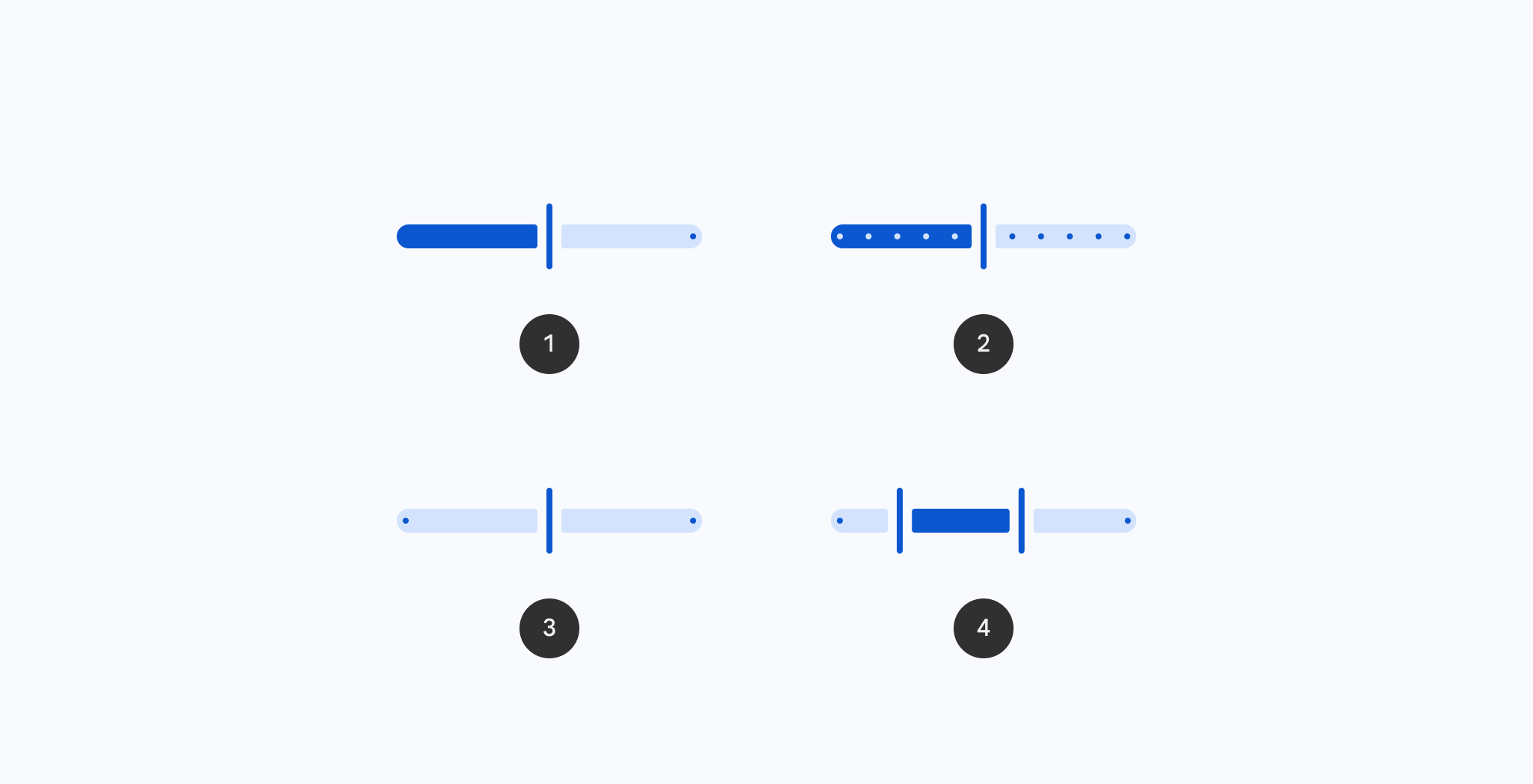

VerticalSlider
Source set: Common
@Composable
public fun VerticalSlider(
    state: SliderState,
    onValueChange: (Float) -> Unit,
    modifier: Modifier = Modifier,
    enabled: Boolean = true,
    onValueChangeFinished: (() -> Unit)? = null,
    topToBottom: Boolean = true,
    colors: SliderColors = SliderDefaults.colors(),
    interactionSource: MutableInteractionSource = remember { MutableInteractionSource() },
    thumb: @Composable (SliderState) -> Unit = { _ ->
        SliderDefaults.Thumb(
            interactionSource = interactionSource,
            isVertical = true,
            colors = colors,
            enabled = enabled,
            thumbSize = VerticalThumbSize,
        )
    },
    track: @Composable (SliderState) -> Unit = { sliderState ->
        SliderDefaults.Track(
            colors = colors,
            enabled = enabled,
            sliderState = sliderState,
            trackCornerSize = Dp.Unspecified,
        )
    },
)
Parameters
| state | SliderState which contains the slider's current value. |
| onValueChange | callback in which value should be updated from the state (e.g. state.value = it) |
| modifier | the Modifier to be applied to this slider |
| enabled | controls the enabled state of this slider. When false, this component will not respond to user input, and it will appear visually disabled and disabled to accessibility services. |
| onValueChangeFinished | called when value change has ended. This should not be used to update the slider value (use onValueChange instead), but rather to know when the user has completed selecting a new value by ending a drag or a click. For keyboard movements, this is called on every step. |
| topToBottom | controls the direction of this slider. When true (default), the slider progresses from top to bottom (top represents the minimum value and bottom represents the maximum value). When false, the slider progresses from bottom to top (bottom represents the minimum value and top represents the maximum value). |
| colors | SliderColors that will be used to resolve the colors used for this slider in different states. See SliderDefaults.colors. |
| interactionSource | the MutableInteractionSource representing the stream of Interactions for this slider. You can create and pass in your own remembered instance to observe Interactions and customize the appearance / behavior of this slider in different states. |
| thumb | the thumb to be displayed on the slider, it is placed on top of the track. The lambda receives a SliderState which is used to obtain the current active track. |
| track | the track to be displayed on the slider, it is placed underneath the thumb. The lambda receives a SliderState which is used to obtain the current active track. |
VerticalSlider
Source set: Common
@Deprecated(message = "Maintained for binary compatibility.", level = DeprecationLevel.HIDDEN)
@Composable
public fun VerticalSlider(
    state: SliderState,
    modifier: Modifier = Modifier,
    enabled: Boolean = true,
    onValueChange: ((Float) -> Unit)? = null,
    onValueChangeFinished: (() -> Unit)? = null,
    topToBottom: Boolean = true,
    colors: SliderColors = SliderDefaults.colors(),
    interactionSource: MutableInteractionSource = remember { MutableInteractionSource() },
    thumb: @Composable (SliderState) -> Unit = { _ ->
        SliderDefaults.Thumb(
            interactionSource = interactionSource,
            isVertical = true,
            colors = colors,
            enabled = enabled,
            thumbSize = VerticalThumbSize,
        )
    },
    track: @Composable (SliderState) -> Unit = { sliderState ->
        SliderDefaults.Track(
            colors = colors,
            enabled = enabled,
            sliderState = sliderState,
            trackCornerSize = Dp.Unspecified,
        )
    },
)
Parameters
| state | SliderState which contains the slider's current value. |
| modifier | the Modifier to be applied to this slider |
| enabled | controls the enabled state of this slider. When false, this component will not respond to user input, and it will appear visually disabled and disabled to accessibility services. |
| onValueChange | callback in which value should be updated |
| onValueChangeFinished | called when value change has ended. This should not be used to update the slider value (use onValueChange instead), but rather to know when the user has completed selecting a new value by ending a drag or a click. For keyboard movements, this is called on every step. |
| topToBottom | controls the direction of this slider. When true (default), the slider progresses from top to bottom (top represents the minimum value and bottom represents the maximum value). When false, the slider progresses from bottom to top (bottom represents the minimum value and top represents the maximum value). |
| colors | SliderColors that will be used to resolve the colors used for this slider in different states. See SliderDefaults.colors. |
| interactionSource | the MutableInteractionSource representing the stream of Interactions for this slider. You can create and pass in your own remembered instance to observe Interactions and customize the appearance / behavior of this slider in different states. |
| thumb | the thumb to be displayed on the slider, it is placed on top of the track. The lambda receives a SliderState which is used to obtain the current active track. |
| track | the track to be displayed on the slider, it is placed underneath the thumb. The lambda receives a SliderState which is used to obtain the current active track. |
