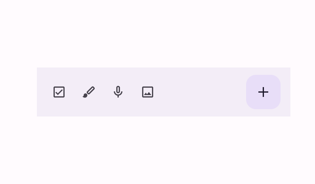
BottomAppBar
Source set: Common
@Deprecated("Maintained for binary compatibility", level = DeprecationLevel.HIDDEN)
@Composable
public fun BottomAppBar(
    actions: @Composable RowScope.() -> Unit,
    modifier: Modifier = Modifier,
    floatingActionButton: @Composable (() -> Unit)? = null,
    containerColor: Color = BottomAppBarDefaults.containerColor,
    contentColor: Color = contentColorFor(containerColor),
    tonalElevation: Dp = BottomAppBarDefaults.ContainerElevation,
    contentPadding: PaddingValues = BottomAppBarDefaults.ContentPadding,
    windowInsets: WindowInsets = BottomAppBarDefaults.windowInsets,
): Unit
Parameters
| actions | the icon content of this BottomAppBar. The default layout here is a Row, so content inside will be placed horizontally. |
| modifier | the Modifier to be applied to this BottomAppBar |
| floatingActionButton | optional floating action button at the end of this BottomAppBar |
| containerColor | the color used for the background of this BottomAppBar. Use Color.Transparent to have no color. |
| contentColor | the preferred color for content inside this BottomAppBar. Defaults to either the matching content color for containerColor, or to the current LocalContentColor if containerColor is not a color from the theme. |
| tonalElevation | when containerColor is ColorScheme.surface, a translucent primary color overlay is applied on top of the container. A higher tonal elevation value will result in a darker color in light theme and lighter color in dark theme. See also: Surface. |
| contentPadding | the padding applied to the content of this BottomAppBar |
| windowInsets | a window insets that app bar will respect. |
BottomAppBar
Source set: Common
@Composable
public fun BottomAppBar(
    actions: @Composable RowScope.() -> Unit,
    modifier: Modifier = Modifier,
    floatingActionButton: @Composable (() -> Unit)? = null,
    containerColor: Color = BottomAppBarDefaults.containerColor,
    contentColor: Color = contentColorFor(containerColor),
    tonalElevation: Dp = BottomAppBarDefaults.ContainerElevation,
    contentPadding: PaddingValues = BottomAppBarDefaults.ContentPadding,
    windowInsets: WindowInsets = BottomAppBarDefaults.windowInsets,
    scrollBehavior: BottomAppBarScrollBehavior? = null,
): Unit
Parameters
| actions | the icon content of this BottomAppBar. The default layout here is a Row, so content inside will be placed horizontally. |
| modifier | the Modifier to be applied to this BottomAppBar |
| floatingActionButton | optional floating action button at the end of this BottomAppBar |
| containerColor | the color used for the background of this BottomAppBar. Use Color.Transparent to have no color. |
| contentColor | the preferred color for content inside this BottomAppBar. Defaults to either the matching content color for containerColor, or to the current LocalContentColor if containerColor is not a color from the theme. |
| tonalElevation | when containerColor is ColorScheme.surface, a translucent primary color overlay is applied on top of the container. A higher tonal elevation value will result in a darker color in light theme and lighter color in dark theme. See also: Surface. |
| contentPadding | the padding applied to the content of this BottomAppBar |
| windowInsets | a window insets that app bar will respect. |
| scrollBehavior | a BottomAppBarScrollBehavior which holds various offset values that will be applied by this bottom app bar to set up its height. A scroll behavior is designed to work in conjunction with a scrolled content to change the bottom app bar appearance as the content scrolls. Note that the bottom app bar will not react to scrolling in case a touch exploration service (e.g., TalkBack) is active. See BottomAppBarScrollBehavior.nestedScrollConnection. |
BottomAppBar
Source set: Common
@Deprecated("Maintained for binary compatibility", level = DeprecationLevel.HIDDEN)
@Composable
public fun BottomAppBar(
    modifier: Modifier = Modifier,
    containerColor: Color = BottomAppBarDefaults.containerColor,
    contentColor: Color = contentColorFor(containerColor),
    tonalElevation: Dp = BottomAppBarDefaults.ContainerElevation,
    contentPadding: PaddingValues = BottomAppBarDefaults.ContentPadding,
    windowInsets: WindowInsets = BottomAppBarDefaults.windowInsets,
    content: @Composable RowScope.() -> Unit,
): Unit
Parameters
| modifier | the Modifier to be applied to this BottomAppBar |
| containerColor | the color used for the background of this BottomAppBar. Use Color.Transparent to have no color. |
| contentColor | the preferred color for content inside this BottomAppBar. Defaults to either the matching content color for containerColor, or to the current LocalContentColor if containerColor is not a color from the theme. |
| tonalElevation | when containerColor is ColorScheme.surface, a translucent primary color overlay is applied on top of the container. A higher tonal elevation value will result in a darker color in light theme and lighter color in dark theme. See also: Surface. |
| contentPadding | the padding applied to the content of this BottomAppBar |
| windowInsets | a window insets that app bar will respect. |
| content | the content of this BottomAppBar. The default layout here is a Row, so content inside will be placed horizontally. |
BottomAppBar
Source set: Common
@Composable
public fun BottomAppBar(
    modifier: Modifier = Modifier,
    containerColor: Color = BottomAppBarDefaults.containerColor,
    contentColor: Color = contentColorFor(containerColor),
    tonalElevation: Dp = BottomAppBarDefaults.ContainerElevation,
    contentPadding: PaddingValues = BottomAppBarDefaults.ContentPadding,
    windowInsets: WindowInsets = BottomAppBarDefaults.windowInsets,
    scrollBehavior: BottomAppBarScrollBehavior? = null,
    content: @Composable RowScope.() -> Unit,
)
Parameters
| modifier | the Modifier to be applied to this BottomAppBar |
| containerColor | the color used for the background of this BottomAppBar. Use Color.Transparent to have no color. |
| contentColor | the preferred color for content inside this BottomAppBar. Defaults to either the matching content color for containerColor, or to the current LocalContentColor if containerColor is not a color from the theme. |
| tonalElevation | when containerColor is ColorScheme.surface, a translucent primary color overlay is applied on top of the container. A higher tonal elevation value will result in a darker color in light theme and lighter color in dark theme. See also: Surface. |
| contentPadding | the padding applied to the content of this BottomAppBar |
| windowInsets | a window insets that app bar will respect. |
| scrollBehavior | a BottomAppBarScrollBehavior which holds various offset values that will be applied by this bottom app bar to set up its height. A scroll behavior is designed to work in conjunction with a scrolled content to change the bottom app bar appearance as the content scrolls. Note that the bottom app bar will not react to scrolling in case a touch exploration service (e.g., TalkBack) is active. See BottomAppBarScrollBehavior.nestedScrollConnection. |
| content | the content of this BottomAppBar. The default layout here is a Row, so content inside will be placed horizontally. |
