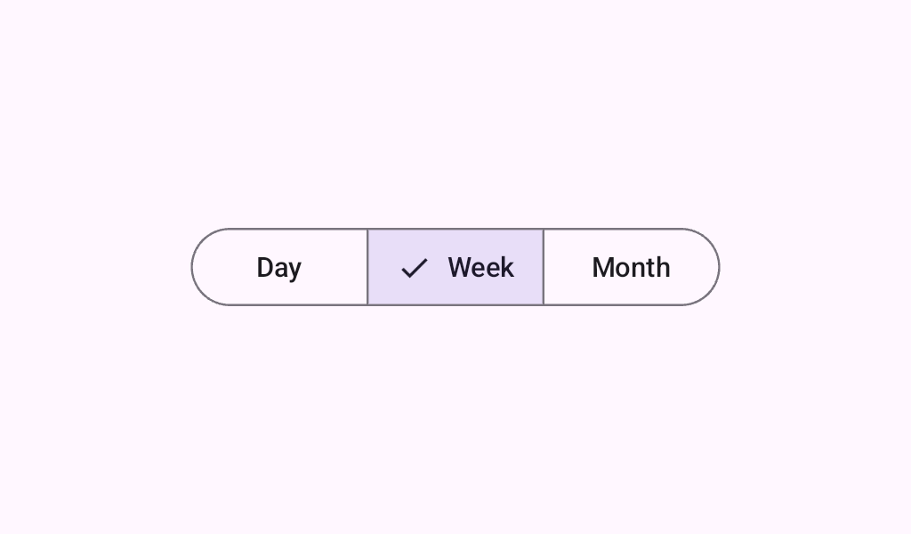
SingleChoiceSegmentedButtonRow
Source set: Common
@Composable
fun SingleChoiceSegmentedButtonRow(
    modifier: Modifier = Modifier,
    space: Dp = SegmentedButtonDefaults.BorderWidth,
    content: @Composable SingleChoiceSegmentedButtonRowScope.() -> Unit,
)
Parameters
| modifier | the Modifier to be applied to this row |
| space | the dimension of the overlap between buttons. Should be equal to the stroke width used on the items. |
| content | the content of this Segmented Button Row, typically a sequence of SegmentedButtons |
