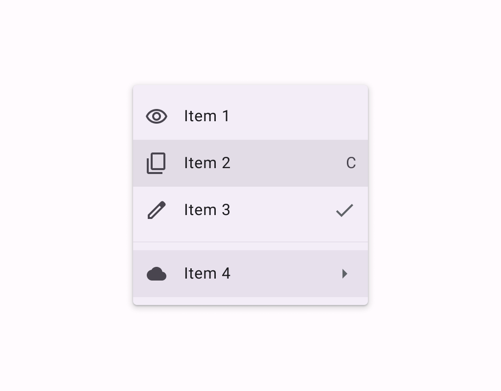
Menus display a list of choices on a temporary surface.
@OptIn(ExperimentalMaterial3ExpressiveApi::class)
@Preview
@Composable
fun ExposedDropdownMenuSample() {
    val options: List<String> = SampleData.take(5)
    var expanded by remember { mutableStateOf(false) }
    val textFieldState = rememberTextFieldState(options[0])
    var checkedIndex: Int by remember { mutableStateOf(0) }
    ExposedDropdownMenuBox(expanded = expanded, onExpandedChange = { expanded = it }) {
        TextField(
            // The `menuAnchor` modifier must be passed to the text field to handle
            // expanding/collapsing the menu on click. A read-only text field has
            // the anchor type `PrimaryNotEditable`.
            modifier = Modifier.menuAnchor(ExposedDropdownMenuAnchorType.PrimaryNotEditable),
            state = textFieldState,
            readOnly = true,
            lineLimits = TextFieldLineLimits.SingleLine,
            label = { Text("Label") },
            trailingIcon = { ExposedDropdownMenuDefaults.TrailingIcon(expanded = expanded) },
            colors = ExposedDropdownMenuDefaults.textFieldColors(),
        )
        ExposedDropdownMenu(
            expanded = expanded,
            onDismissRequest = { expanded = false },
            containerColor = MenuDefaults.groupStandardContainerColor,
            shape = MenuDefaults.standaloneGroupShape,
        ) {
            val optionCount = options.size
            options.forEachIndexed { index, option ->
                DropdownMenuItem(
                    shapes = MenuDefaults.itemShape(index, optionCount),
                    text = { Text(option, style = MaterialTheme.typography.bodyLarge) },
                    selected = index == checkedIndex,
                    onClick = {
                        textFieldState.setTextAndPlaceCursorAtEnd(option)
                        checkedIndex = index
                        expanded = false
                    },
                    selectedLeadingIcon = {
                        Icon(
                            Icons.Filled.Check,
                            modifier = Modifier.size(MenuDefaults.LeadingIconSize),
                            contentDescription = null,
                        )
                    },
                    contentPadding = ExposedDropdownMenuDefaults.ItemContentPadding,
                )
            }
        }
    }
}
@OptIn(ExperimentalMaterial3Api::class, ExperimentalMaterial3ExpressiveApi::class)
@Preview
@Composable
fun GroupedMenuSample() {
    val groupInteractionSource = remember { MutableInteractionSource() }
    var expanded by remember { mutableStateOf(false) }
    val groupLabels = listOf("Modification", "Navigation")
    val groupItemLabels = listOf(listOf("Edit", "Settings"), listOf("Home", "More Options"))
    val groupItemLeadingIcons =
        listOf(
            listOf(Icons.Outlined.Edit, Icons.Outlined.Settings),
            listOf(null, Icons.Outlined.Info),
        )
    val groupItemCheckedLeadingIcons =
        listOf(
            listOf(Icons.Filled.Edit, Icons.Filled.Settings),
            listOf(Icons.Filled.Check, Icons.Filled.Info),
        )
    val groupItemTrailingIcons: List<List<ImageVector?>> =
        listOf(listOf(null, null), listOf(Icons.Outlined.Home, Icons.Outlined.MoreVert))
    val groupItemCheckedTrailingIcons: List<List<ImageVector?>> =
        listOf(listOf(null, null), listOf(Icons.Filled.Home, Icons.Filled.MoreVert))
    val groupItemSupportingText: List<List<String?>> =
        listOf(listOf("Edit mode", null), listOf(null, "Opens menu"))
    val checked = remember {
        listOf(mutableStateListOf(false, false), mutableStateListOf(false, false))
    }
    Box(modifier = Modifier.fillMaxSize().wrapContentSize(Alignment.TopStart)) {
        // Icon button should have a tooltip associated with it for a11y.
        TooltipBox(
            positionProvider =
                TooltipDefaults.rememberTooltipPositionProvider(TooltipAnchorPosition.Above),
            tooltip = {
                PlainTooltip(
                    Modifier.semantics {
                        // TODO(b/496338253): Remove this modifier once bug where tooltip text is
                        //  not announced by a11y screen readers is resolved.
                        liveRegion = LiveRegionMode.Assertive
                        paneTitle = "Localized description"
                    }
                ) {
                    Text("Localized description")
                }
            },
            state = rememberTooltipState(),
        ) {
            IconButton(onClick = { expanded = true }) {
                Icon(Icons.Default.MoreVert, contentDescription = "Localized description")
            }
        }
        DropdownMenuPopup(expanded = expanded, onDismissRequest = { expanded = false }) {
            val groupCount = groupLabels.size
            groupLabels.fastForEachIndexed { groupIndex, label ->
                DropdownMenuGroup(
                    shapes = MenuDefaults.groupShape(groupIndex, groupCount),
                    interactionSource = groupInteractionSource,
                ) {
                    MenuDefaults.DropdownMenuGroupLabel { Text(label) }
                    HorizontalDivider(
                        modifier = Modifier.padding(MenuDefaults.HorizontalDividerPadding)
                    )
                    val groupItemCount = groupItemLabels[groupIndex].size
                    groupItemLabels[groupIndex].fastForEachIndexed { itemIndex, itemLabel ->
                        DropdownMenuItem(
                            text = { Text(itemLabel) },
                            supportingText =
                                groupItemSupportingText[groupIndex][itemIndex]?.let { supportingText
                                    ->
                                    { Text(supportingText) }
                                },
                            shapes = MenuDefaults.itemShape(itemIndex, groupItemCount),
                            leadingIcon =
                                groupItemLeadingIcons[groupIndex][itemIndex]?.let { iconData ->
                                    {
                                        Icon(
                                            iconData,
                                            modifier = Modifier.size(MenuDefaults.LeadingIconSize),
                                            contentDescription = null,
                                        )
                                    }
                                },
                            checkedLeadingIcon = {
                                Icon(
                                    groupItemCheckedLeadingIcons[groupIndex][itemIndex],
                                    modifier = Modifier.size(MenuDefaults.LeadingIconSize),
                                    contentDescription = null,
                                )
                            },
                            trailingIcon =
                                if (checked[groupIndex][itemIndex]) {
                                    groupItemCheckedTrailingIcons[groupIndex][itemIndex]?.let {
                                        iconData ->
                                        {
                                            Icon(
                                                iconData,
                                                modifier =
                                                    Modifier.size(MenuDefaults.TrailingIconSize),
                                                contentDescription = null,
                                            )
                                        }
                                    }
                                } else {
                                    groupItemTrailingIcons[groupIndex][itemIndex]?.let { iconData ->
                                        {
                                            Icon(
                                                iconData,
                                                modifier =
                                                    Modifier.size(MenuDefaults.TrailingIconSize),
                                                contentDescription = null,
                                            )
                                        }
                                    }
                                },
                            checked = checked[groupIndex][itemIndex],
                            onCheckedChange = { checked[groupIndex][itemIndex] = it },
                        )
                    }
                }
                if (groupIndex != groupCount - 1) {
                    Spacer(Modifier.height(MenuDefaults.GroupSpacing))
                }
            }
            if (checked.last().last()) {
                DropdownMenuButtonGroup()
            }
        }
    }
}
@OptIn(ExperimentalMaterial3Api::class, ExperimentalMaterial3ExpressiveApi::class)
@Preview
@Composable
fun MenuSample() {
    var expanded by remember { mutableStateOf(false) }
    Box(modifier = Modifier.fillMaxSize().wrapContentSize(Alignment.TopStart)) {
        // Icon button should have a tooltip associated with it for a11y.
        TooltipBox(
            positionProvider =
                TooltipDefaults.rememberTooltipPositionProvider(TooltipAnchorPosition.Above),
            tooltip = {
                PlainTooltip(
                    Modifier.semantics {
                        // TODO(b/496338253): Remove this modifier once bug where tooltip text is
                        //  not announced by a11y screen readers is resolved.
                        liveRegion = LiveRegionMode.Assertive
                        paneTitle = "Localized description"
                    }
                ) {
                    Text("Localized description")
                }
            },
            state = rememberTooltipState(),
        ) {
            IconButton(onClick = { expanded = true }) {
                Icon(Icons.Default.MoreVert, contentDescription = "Localized description")
            }
        }
        DropdownMenu(expanded = expanded, onDismissRequest = { expanded = false }) {
            DropdownMenuItem(
                text = { Text("Edit") },
                onClick = { /* Handle edit! */ },
                leadingIcon = { Icon(Icons.Outlined.Edit, contentDescription = null) },
            )
            DropdownMenuItem(
                text = { Text("Settings") },
                onClick = { /* Handle settings! */ },
                leadingIcon = { Icon(Icons.Outlined.Settings, contentDescription = null) },
            )
            HorizontalDivider()
            DropdownMenuItem(
                text = { Text("Send Feedback") },
                onClick = { /* Handle send feedback! */ },
                leadingIcon = { Icon(Icons.Outlined.Email, contentDescription = null) },
                trailingIcon = { Text("F11", textAlign = TextAlign.Center) },
            )
        }
    }
}