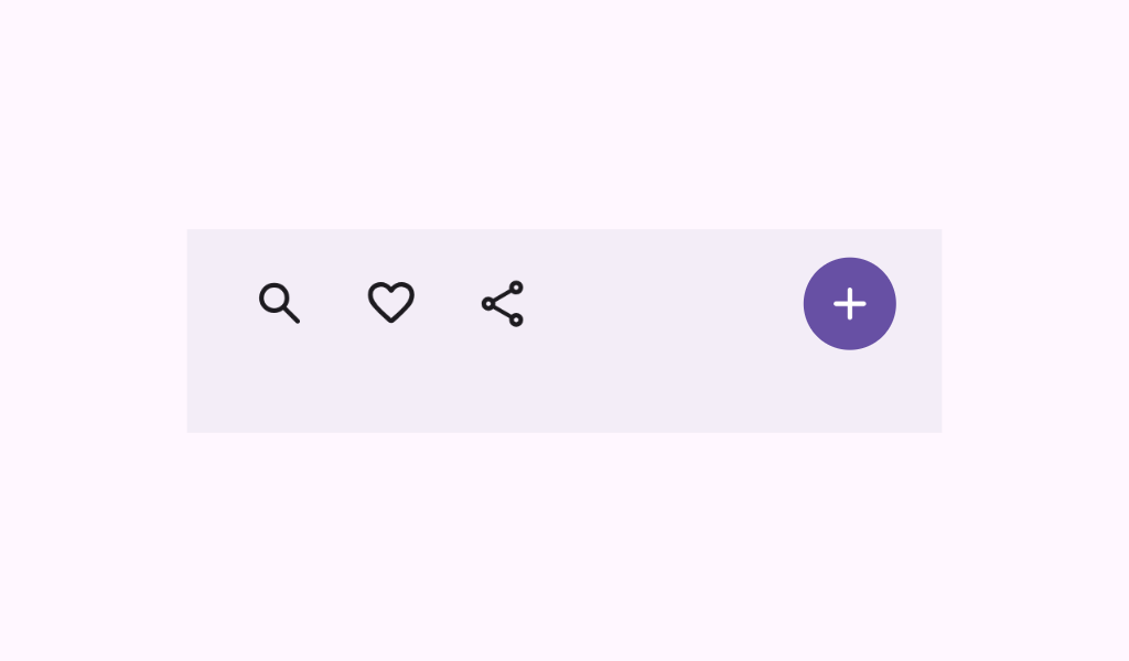
Material Design flexible bottom app bar A flexible bottom app bar displays navigation and key actions at the bottom of small screens.
BottomAppBarWithOverflow
@Preview
@Sampled
@Composable
fun BottomAppBarWithOverflow() {
    val icons =
        listOf(
            Icons.AutoMirrored.Filled.ArrowBack,
            Icons.AutoMirrored.Filled.ArrowForward,
            Icons.Filled.Add,
            Icons.Filled.Check,
            Icons.Filled.Edit,
            Icons.Filled.Favorite,
        )
    val items = listOf("Back", "Forward", "Add", "Check", "Edit", "Favorite")
    FlexibleBottomAppBar(
        contentPadding = PaddingValues(horizontal = 96.dp),
        horizontalArrangement = BottomAppBarDefaults.FlexibleFixedHorizontalArrangement,
    ) {
        AppBarRow(
            overflowIndicator = { menuState ->
                TooltipBox(
                    positionProvider =
                        TooltipDefaults.rememberTooltipPositionProvider(
                            TooltipAnchorPosition.Above
                        ),
                    tooltip = {
                        PlainTooltip(
                            modifier =
                                Modifier.semantics {
                                    // TODO(b/496338253): Remove this modifier once bug where
                                    // tooltip text
                                    // is not announced
                                    //  by a11y screen readers is resolved.
                                    liveRegion = LiveRegionMode.Assertive
                                    paneTitle = "Overflow"
                                }
                        ) {
                            Text("Overflow")
                        }
                    },
                    state = rememberTooltipState(),
                ) {
                    IconButton(
                        onClick = {
                            if (menuState.isShowing) {
                                menuState.dismiss()
                            } else {
                                menuState.show()
                            }
                        }
                    ) {
                        Icon(imageVector = Icons.Filled.MoreVert, contentDescription = "Overflow")
                    }
                }
            }
        ) {
            items.forEachIndexed { index, item ->
                clickableItem(
                    onClick = { /* doSomething() */ },
                    icon = { Icon(icons[index], contentDescription = item) },
                    label = item,
                )
            }
        }
    }
}
ExitAlwaysBottomAppBarSpacedAround
@Preview
@Sampled
@Composable
fun ExitAlwaysBottomAppBarSpacedAround() {
    val scrollBehavior = BottomAppBarDefaults.exitAlwaysScrollBehavior()
    val icons =
        listOf(
            Icons.AutoMirrored.Filled.ArrowBack,
            Icons.AutoMirrored.Filled.ArrowForward,
            Icons.Filled.Add,
            Icons.Filled.Check,
            Icons.Filled.Edit,
        )
    val buttons = listOf("Back", "Forward", "Add", "Check", "Edit")

    Scaffold(
        modifier = Modifier.nestedScroll(scrollBehavior.nestedScrollConnection),
        bottomBar = {
            FlexibleBottomAppBar(
                horizontalArrangement = Arrangement.SpaceAround,
                contentPadding = PaddingValues(horizontal = 0.dp),
                scrollBehavior = scrollBehavior,
                content = {
                    buttons.forEachIndexed { index, button ->
                        TooltipBox(
                            positionProvider =
                                TooltipDefaults.rememberTooltipPositionProvider(
                                    TooltipAnchorPosition.Above
                                ),
                            tooltip = {
                                PlainTooltip(
                                    modifier =
                                        Modifier.semantics {
                                            // TODO(b/496338253): Remove this modifier once bug
                                            // where
                                            // tooltip text is not announced
                                            //  by a11y screen readers is resolved.
                                            liveRegion = LiveRegionMode.Assertive
                                            paneTitle = button
                                        }
                                ) {
                                    Text(button)
                                }
                            },
                            state = rememberTooltipState(),
                        ) {
                            if (index == 2) {
                                FilledIconButton(
                                    modifier = Modifier.width(56.dp),
                                    onClick = { /* doSomething() */ },
                                ) {
                                    Icon(icons[index], contentDescription = button)
                                }
                            } else {
                                IconButton(onClick = { /* doSomething() */ }) {
                                    Icon(icons[index], contentDescription = button)
                                }
                            }
                        }
                    }
                },
            )
        },
        content = { innerPadding ->
            LazyColumn(
                contentPadding = innerPadding,
                verticalArrangement = Arrangement.spacedBy(8.dp),
            ) {
                val list = (0..75).map { it.toString() }
                items(count = list.size) {
                    Text(
                        text = list[it],
                        style = MaterialTheme.typography.bodyLarge,
                        modifier = Modifier.fillMaxWidth().padding(horizontal = 16.dp),
                    )
                }
            }
        },
    )
}

/**
 * A sample for a [FlexibleBottomAppBar] that collapses when the content is scrolled up, and appears
 * when the content scrolled down. The content is spaced between.
 */
ExitAlwaysBottomAppBarSpacedBetween
@Preview
@Sampled
@Composable
fun ExitAlwaysBottomAppBarSpacedBetween() {
    val scrollBehavior = BottomAppBarDefaults.exitAlwaysScrollBehavior()
    val icons =
        listOf(
            Icons.AutoMirrored.Filled.ArrowBack,
            Icons.AutoMirrored.Filled.ArrowForward,
            Icons.Filled.Add,
            Icons.Filled.Check,
            Icons.Filled.Edit,
        )
    val buttons = listOf("Back", "Forward", "Add", "Check", "Edit")
    Scaffold(
        modifier = Modifier.nestedScroll(scrollBehavior.nestedScrollConnection),
        bottomBar = {
            FlexibleBottomAppBar(
                horizontalArrangement = Arrangement.SpaceBetween,
                scrollBehavior = scrollBehavior,
                content = {
                    buttons.forEachIndexed { index, button ->
                        TooltipBox(
                            positionProvider =
                                TooltipDefaults.rememberTooltipPositionProvider(
                                    TooltipAnchorPosition.Above
                                ),
                            tooltip = {
                                PlainTooltip(
                                    modifier =
                                        Modifier.semantics {
                                            // TODO(b/496338253): Remove this modifier once bug
                                            // where
                                            // tooltip text is not announced
                                            //  by a11y screen readers is resolved.
                                            liveRegion = LiveRegionMode.Assertive
                                            paneTitle = button
                                        }
                                ) {
                                    Text(button)
                                }
                            },
                            state = rememberTooltipState(),
                        ) {
                            if (index == 2) {
                                FilledIconButton(
                                    modifier = Modifier.width(56.dp),
                                    onClick = { /* doSomething() */ },
                                ) {
                                    Icon(icons[index], contentDescription = button)
                                }
                            } else {
                                IconButton(onClick = { /* doSomething() */ }) {
                                    Icon(icons[index], contentDescription = button)
                                }
                            }
                        }
                    }
                },
            )
        },
        content = { innerPadding ->
            LazyColumn(
                contentPadding = innerPadding,
                verticalArrangement = Arrangement.spacedBy(8.dp),
            ) {
                val list = (0..75).map { it.toString() }
                items(count = list.size) {
                    Text(
                        text = list[it],
                        style = MaterialTheme.typography.bodyLarge,
                        modifier = Modifier.fillMaxWidth().padding(horizontal = 16.dp),
                    )
                }
            }
        },
    )
}

/**
 * A sample for a [FlexibleBottomAppBar] that collapses when the content is scrolled up, and appears
 * when the content scrolled down. The content is spaced evenly.
 */
ExitAlwaysBottomAppBarSpacedEvenly
@Preview
@Sampled
@Composable
fun ExitAlwaysBottomAppBarSpacedEvenly() {
    val scrollBehavior = BottomAppBarDefaults.exitAlwaysScrollBehavior()
    val icons =
        listOf(
            Icons.AutoMirrored.Filled.ArrowBack,
            Icons.AutoMirrored.Filled.ArrowForward,
            Icons.Filled.Add,
            Icons.Filled.Check,
            Icons.Filled.Edit,
        )
    val buttons = listOf("Back", "Forward", "Add", "Check", "Edit")
    Scaffold(
        modifier = Modifier.nestedScroll(scrollBehavior.nestedScrollConnection),
        bottomBar = {
            FlexibleBottomAppBar(
                horizontalArrangement = Arrangement.SpaceEvenly,
                contentPadding = PaddingValues(horizontal = 0.dp),
                scrollBehavior = scrollBehavior,
                content = {
                    buttons.forEachIndexed { index, button ->
                        TooltipBox(
                            positionProvider =
                                TooltipDefaults.rememberTooltipPositionProvider(
                                    TooltipAnchorPosition.Above
                                ),
                            tooltip = {
                                PlainTooltip(
                                    modifier =
                                        Modifier.semantics {
                                            // TODO(b/496338253): Remove this modifier once bug
                                            // where
                                            // tooltip text is not announced
                                            //  by a11y screen readers is resolved.
                                            liveRegion = LiveRegionMode.Assertive
                                            paneTitle = button
                                        }
                                ) {
                                    Text(button)
                                }
                            },
                            state = rememberTooltipState(),
                        ) {
                            if (index == 2) {
                                FilledIconButton(
                                    modifier = Modifier.width(56.dp),
                                    onClick = { /* doSomething() */ },
                                ) {
                                    Icon(icons[index], contentDescription = button)
                                }
                            } else {
                                IconButton(onClick = { /* doSomething() */ }) {
                                    Icon(icons[index], contentDescription = button)
                                }
                            }
                        }
                    }
                },
            )
        },
        content = { innerPadding ->
            LazyColumn(
                contentPadding = innerPadding,
                verticalArrangement = Arrangement.spacedBy(8.dp),
            ) {
                val list = (0..75).map { it.toString() }
                items(count = list.size) {
                    Text(
                        text = list[it],
                        style = MaterialTheme.typography.bodyLarge,
                        modifier = Modifier.fillMaxWidth().padding(horizontal = 16.dp),
                    )
                }
            }
        },
    )
}

/**
 * A sample for a [FlexibleBottomAppBar] that collapses when the content is scrolled up, and appears
 * when the content scrolled down. The content arrangement is fixed.
 */
ExitAlwaysBottomAppBarFixed
@Preview
@Sampled
@Composable
fun ExitAlwaysBottomAppBarFixed() {
    val scrollBehavior = BottomAppBarDefaults.exitAlwaysScrollBehavior()
    val icons =
        listOf(
            Icons.AutoMirrored.Filled.ArrowBack,
            Icons.AutoMirrored.Filled.ArrowForward,
            Icons.Filled.Add,
            Icons.Filled.Check,
            Icons.Filled.Edit,
        )
    val buttons = listOf("Back", "Forward", "Add", "Check", "Edit")
    Scaffold(
        modifier = Modifier.nestedScroll(scrollBehavior.nestedScrollConnection),
        bottomBar = {
            FlexibleBottomAppBar(
                horizontalArrangement = BottomAppBarDefaults.FlexibleFixedHorizontalArrangement,
                scrollBehavior = scrollBehavior,
                content = {
                    buttons.forEachIndexed { index, button ->
                        TooltipBox(
                            positionProvider =
                                TooltipDefaults.rememberTooltipPositionProvider(
                                    TooltipAnchorPosition.Above
                                ),
                            tooltip = {
                                PlainTooltip(
                                    modifier =
                                        Modifier.semantics {
                                            // TODO(b/496338253): Remove this modifier once bug
                                            // where
                                            // tooltip text is not announced
                                            //  by a11y screen readers is resolved.
                                            liveRegion = LiveRegionMode.Assertive
                                            paneTitle = button
                                        }
                                ) {
                                    Text(button)
                                }
                            },
                            state = rememberTooltipState(),
                        ) {
                            if (index == 2) {
                                FilledIconButton(
                                    modifier = Modifier.width(56.dp),
                                    onClick = { /* doSomething() */ },
                                ) {
                                    Icon(icons[index], contentDescription = button)
                                }
                            } else {
                                IconButton(onClick = { /* doSomething() */ }) {
                                    Icon(icons[index], contentDescription = button)
                                }
                            }
                        }
                    }
                },
            )
        },
        content = { innerPadding ->
            LazyColumn(
                contentPadding = innerPadding,
                verticalArrangement = Arrangement.spacedBy(8.dp),
            ) {
                val list = (0..75).map { it.toString() }
                items(count = list.size) {
                    Text(
                        text = list[it],
                        style = MaterialTheme.typography.bodyLarge,
                        modifier = Modifier.fillMaxWidth().padding(horizontal = 16.dp),
                    )
                }
            }
        },
    )
}

/**
 * A sample for a vibrant [FlexibleBottomAppBar] that collapses when the content is scrolled up, and
 * appears when the content scrolled down. The content arrangement is fixed.
 */
ExitAlwaysBottomAppBarFixedVibrant
@Preview
@Sampled
@Composable
fun ExitAlwaysBottomAppBarFixedVibrant() {
    val scrollBehavior = BottomAppBarDefaults.exitAlwaysScrollBehavior()
    val icons =
        listOf(
            Icons.AutoMirrored.Filled.ArrowBack,
            Icons.AutoMirrored.Filled.ArrowForward,
            Icons.Filled.Add,
            Icons.Filled.Check,
            Icons.Filled.Edit,
        )
    val buttons = listOf("Back", "Forward", "Add", "Check", "Edit")
    Scaffold(
        modifier = Modifier.nestedScroll(scrollBehavior.nestedScrollConnection),
        bottomBar = {
            FlexibleBottomAppBar(
                horizontalArrangement = BottomAppBarDefaults.FlexibleFixedHorizontalArrangement,
                scrollBehavior = scrollBehavior,
                containerColor =
                    MaterialTheme.colorScheme.primaryContainer, // TODO(b/356885344): tokens
                content = {
                    buttons.forEachIndexed { index, button ->
                        TooltipBox(
                            positionProvider =
                                TooltipDefaults.rememberTooltipPositionProvider(
                                    TooltipAnchorPosition.Above
                                ),
                            tooltip = {
                                PlainTooltip(
                                    modifier =
                                        Modifier.semantics {
                                            // TODO(b/496338253): Remove this modifier once bug
                                            // where
                                            // tooltip text is not announced
                                            //  by a11y screen readers is resolved.
                                            liveRegion = LiveRegionMode.Assertive
                                            paneTitle = button
                                        }
                                ) {
                                    Text(button)
                                }
                            },
                            state = rememberTooltipState(),
                        ) {
                            if (index == 2) {
                                FilledIconButton(
                                    modifier = Modifier.width(56.dp),
                                    onClick = { /* doSomething() */ },
                                ) {
                                    Icon(icons[index], contentDescription = button)
                                }
                            } else {
                                IconButton(onClick = { /* doSomething() */ }) {
                                    Icon(icons[index], contentDescription = button)
                                }
                            }
                        }
                    }
                },
            )
        },
        content = { innerPadding ->
            LazyColumn(
                contentPadding = innerPadding,
                verticalArrangement = Arrangement.spacedBy(8.dp),
            ) {
                val list = (0..75).map { it.toString() }
                items(count = list.size) {
                    Text(
                        text = list[it],
                        style = MaterialTheme.typography.bodyLarge,
                        modifier = Modifier.fillMaxWidth().padding(horizontal = 16.dp),
                    )
                }
            }
        },
    )
}

/** A sample for a [FlexibleBottomAppBar] with an overflow behavior when the content doesn't fit. */