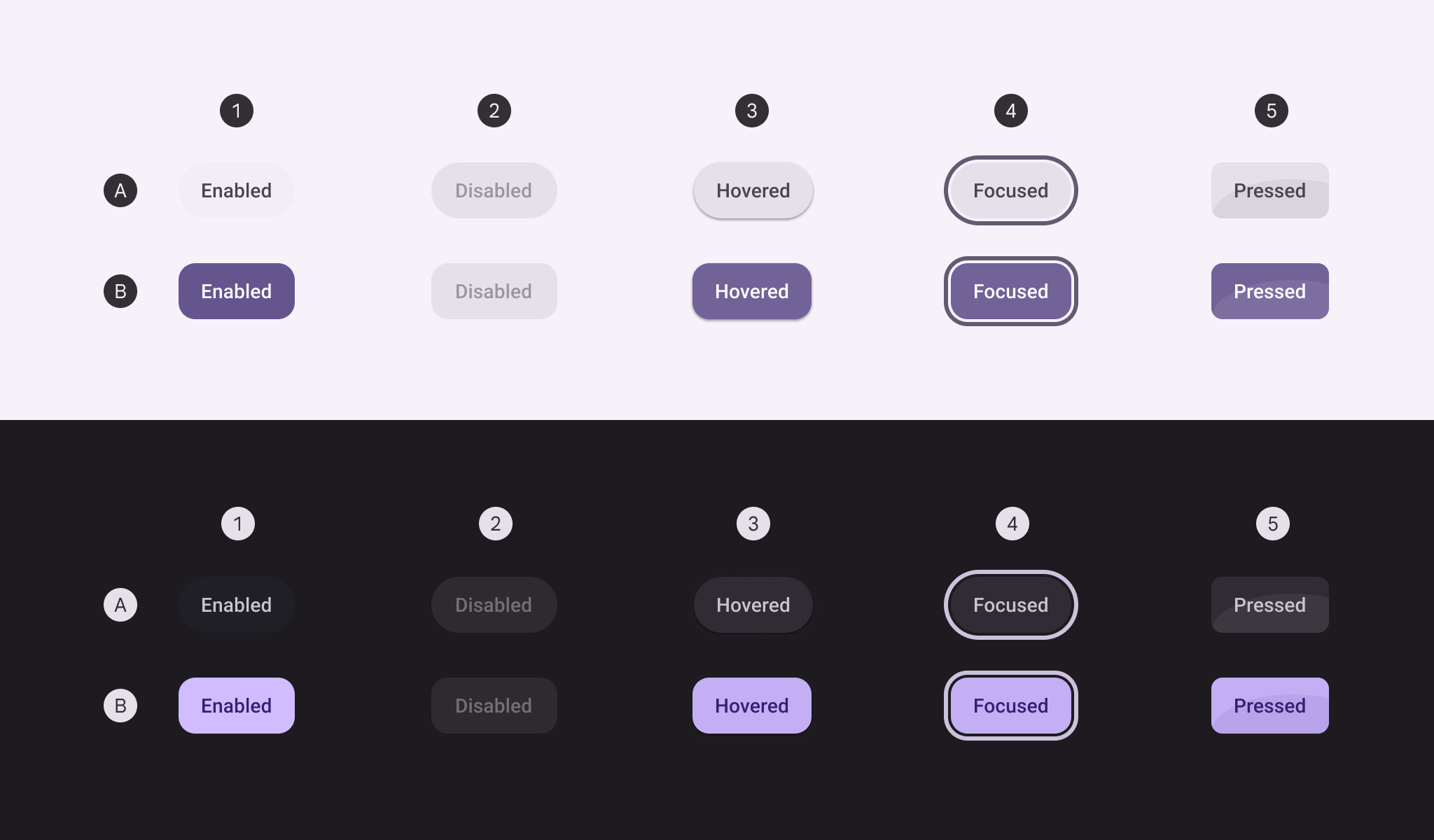
Material Design toggle button Toggle button is a filled toggleable button that switches between primary and tonal colors depending on checked's value.
@Preview
@Sampled
@Composable
fun ToggleButtonSample() {
    var checked by rememberSaveable { mutableStateOf(false) }
    ToggleButton(checked = checked, onCheckedChange = { checked = it }) { Text("Button") }
}
@Preview
@Sampled
@Composable
fun ToggleButtonWithIconSample() {
    var checked by rememberSaveable { mutableStateOf(false) }
    ToggleButton(
        checked = checked,
        onCheckedChange = { checked = it },
        icon = {
            Icon(
                if (checked) Icons.Filled.Edit else Icons.Outlined.Edit,
                contentDescription = "Localized description",
            )
        },
    ) {
        Text("Edit")
    }
}
@Preview
@Sampled
@Composable
fun XSmallToggleButtonWithIconSample() {
    var checked by rememberSaveable { mutableStateOf(false) }
    ToggleButton(
        checked = checked,
        onCheckedChange = { checked = it },
        buttonSize = ToggleButtonSize.ExtraSmall,
        icon = {
            Icon(
                if (checked) Icons.Filled.Edit else Icons.Outlined.Edit,
                contentDescription = "Localized description",
            )
        },
    ) {
        Text("Label")
    }
}
@Preview
@Sampled
@Composable
fun MediumToggleButtonWithIconSample() {
    var checked by rememberSaveable { mutableStateOf(false) }
    ToggleButton(
        checked = checked,
        onCheckedChange = { checked = it },
        buttonSize = ToggleButtonSize.Medium,
        icon = {
            Icon(
                if (checked) Icons.Filled.Edit else Icons.Outlined.Edit,
                contentDescription = "Localized description",
            )
        },
    ) {
        Text("Label")
    }
}
@Preview
@Sampled
@Composable
fun LargeToggleButtonWithIconSample() {
    var checked by rememberSaveable { mutableStateOf(false) }
    ToggleButton(
        checked = checked,
        onCheckedChange = { checked = it },
        buttonSize = ToggleButtonSize.Large,
        icon = {
            Icon(
                if (checked) Icons.Filled.Edit else Icons.Outlined.Edit,
                contentDescription = "Localized description",
            )
        },
    ) {
        Text("Label")
    }
}
@Preview
@Sampled
@Composable
fun XLargeToggleButtonWithIconSample() {
    var checked by rememberSaveable { mutableStateOf(false) }
    ToggleButton(
        checked = checked,
        onCheckedChange = { checked = it },
        buttonSize = ToggleButtonSize.ExtraLarge,
        icon = {
            Icon(
                if (checked) Icons.Filled.Edit else Icons.Outlined.Edit,
                contentDescription = "Localized description",
            )
        },
    ) {
        Text("Label")
    }
}
@Preview
@Sampled
@Composable
fun ToggleButtonWithButtonSizeSample() {
    var checked by rememberSaveable { mutableStateOf(false) }
    ToggleButton(
        checked = checked,
        onCheckedChange = { checked = it },
        buttonSize = ToggleButtonSize.Small,
        icon = {
            Icon(
                if (checked) Icons.Filled.Edit else Icons.Outlined.Edit,
                contentDescription = "Localized description",
            )
        },
    ) {
        Text("Label")
    }
}