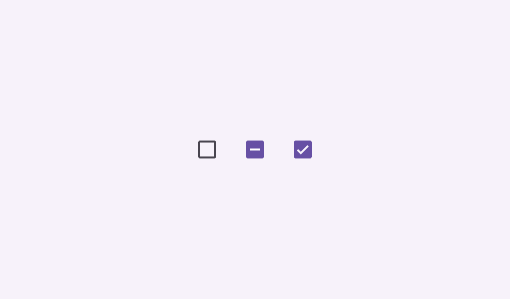
Checkboxes can have a parent-child relationship with other checkboxes.
TriStateCheckboxRoundedStrokesSample
@Preview
@Composable
fun TriStateCheckboxRoundedStrokesSample() {
    val strokeWidthPx = with(LocalDensity.current) { floor(CheckboxDefaults.StrokeWidth.toPx()) }
    val checkmarkStroke =
        remember(strokeWidthPx) {
            Stroke(width = strokeWidthPx, cap = StrokeCap.Round, join = StrokeJoin.Round)
        }
    val outlineStroke = remember(strokeWidthPx) { Stroke(width = strokeWidthPx) }
    Column {
        // define dependent checkboxes states
        val (state, onStateChange) = remember { mutableStateOf(true) }
        val (state2, onStateChange2) = remember { mutableStateOf(true) }
        // TriStateCheckbox state reflects state of dependent checkboxes
        val parentState =
            remember(state, state2) {
                if (state && state2) ToggleableState.On
                else if (!state && !state2) ToggleableState.Off else ToggleableState.Indeterminate
            }
        // click on TriStateCheckbox can set state for dependent checkboxes
        val onParentClick = {
            val s = parentState != ToggleableState.On
            onStateChange(s)
            onStateChange2(s)
        }
        // The sample below composes just basic checkboxes which are not fully accessible on their
        // own. See the CheckboxWithTextSample as a way to ensure your checkboxes are fully
        // accessible.
        Row(
            verticalAlignment = Alignment.CenterVertically,
            modifier =
                Modifier.triStateToggleable(
                    state = parentState,
                    onClick = onParentClick,
                    role = Role.Checkbox,
                ),
        ) {
            TriStateCheckbox(
                state = parentState,
                onClick = null,
                checkmarkStroke = checkmarkStroke,
                outlineStroke = outlineStroke,
            )
            Text("Receive Emails")
        }
        Spacer(Modifier.size(25.dp))
        Column(Modifier.padding(24.dp, 0.dp, 0.dp, 0.dp)) {
            Row(
                verticalAlignment = Alignment.CenterVertically,
                modifier =
                    Modifier.toggleable(
                        value = state,
                        onValueChange = onStateChange,
                        role = Role.Checkbox,
                    ),
            ) {
                Checkbox(
                    checked = state,
                    onCheckedChange = null,
                    checkmarkStroke = checkmarkStroke,
                    outlineStroke = outlineStroke,
                )
                Text("Daily")
            }
            Spacer(Modifier.size(25.dp))
            Row(
                verticalAlignment = Alignment.CenterVertically,
                modifier =
                    Modifier.toggleable(
                        value = state2,
                        onValueChange = onStateChange2,
                        role = Role.Checkbox,
                    ),
            ) {
                Checkbox(
                    checked = state2,
                    onCheckedChange = null,
                    checkmarkStroke = checkmarkStroke,
                    outlineStroke = outlineStroke,
                )
                Text("Weekly")
            }
        }
    }
}
TriStateCheckboxSample
@Preview
@Composable
fun TriStateCheckboxSample() {
    Column {
        // define dependent checkboxes states
        val (state, onStateChange) = remember { mutableStateOf(true) }
        val (state2, onStateChange2) = remember { mutableStateOf(true) }
        // TriStateCheckbox state reflects state of dependent checkboxes
        val parentState =
            remember(state, state2) {
                if (state && state2) ToggleableState.On
                else if (!state && !state2) ToggleableState.Off else ToggleableState.Indeterminate
            }
        // click on TriStateCheckbox can set state for dependent checkboxes
        val onParentClick = {
            val s = parentState != ToggleableState.On
            onStateChange(s)
            onStateChange2(s)
        }
        // The sample below composes just basic checkboxes which are not fully accessible on their
        // own. See the CheckboxWithTextSample as a way to ensure your checkboxes are fully
        // accessible.
        Row(
            verticalAlignment = Alignment.CenterVertically,
            modifier =
                Modifier.triStateToggleable(
                    state = parentState,
                    onClick = onParentClick,
                    role = Role.Checkbox,
                ),
        ) {
            TriStateCheckbox(state = parentState, onClick = null)
            Text("Receive Emails")
        }
        Spacer(Modifier.size(25.dp))
        Column(Modifier.padding(24.dp, 0.dp, 0.dp, 0.dp)) {
            Row(
                verticalAlignment = Alignment.CenterVertically,
                modifier =
                    Modifier.toggleable(
                        value = state,
                        onValueChange = onStateChange,
                        role = Role.Checkbox,
                    ),
            ) {
                Checkbox(state, null)
                Text("Daily")
            }
            Spacer(Modifier.size(25.dp))
            Row(
                verticalAlignment = Alignment.CenterVertically,
                modifier =
                    Modifier.toggleable(
                        value = state2,
                        onValueChange = onStateChange2,
                        role = Role.Checkbox,
                    ),
            ) {
                Checkbox(state2, null)
                Text("Weekly")
            }
        }
    }
}