Badge
Composable Component
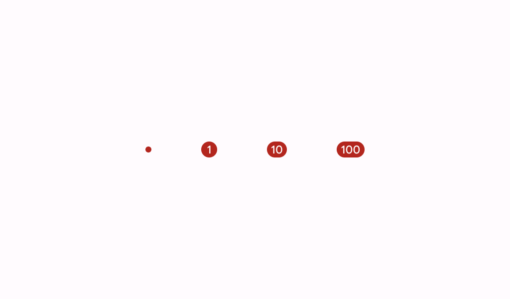
A badge represents dynamic information such as a number of pending requests in a navigation bar.
Common
@Composable
fun Badge(
    modifier: Modifier = Modifier,
    containerColor: Color = BadgeDefaults.containerColor,
    contentColor: Color = contentColorFor(containerColor),
    content: @Composable (RowScope.() -> Unit)? = null,
)
Parameters
| modifier | the Modifier to be applied to this badge |
| containerColor | the color used for the background of this badge |
| contentColor | the preferred color for content inside this badge. Defaults to either the matching content color for containerColor, or to the current LocalContentColor if containerColor is not a color from the theme. |
| content | optional content to be rendered inside this badge |
Create your own Component Library
Material Components are meant to be used as is and they do not allow customizations. To build your own Jetpack Compose component library use Compose Unstyled

