WideNavigationRail
Composable Component
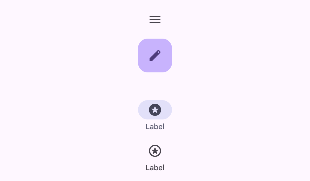
Material design wide navigation rail.
Common
@Composable
fun WideNavigationRail(
    modifier: Modifier = Modifier,
    state: WideNavigationRailState = rememberWideNavigationRailState(),
    shape: Shape = WideNavigationRailDefaults.shape,
    colors: WideNavigationRailColors = WideNavigationRailDefaults.colors(),
    header: @Composable (() -> Unit)? = null,
    windowInsets: WindowInsets = WideNavigationRailDefaults.windowInsets,
    arrangement: Arrangement.Vertical = WideNavigationRailDefaults.arrangement,
    content: @Composable () -> Unit,
)
Parameters
| modifier | the Modifier to be applied to this wide navigation rail |
| state | the WideNavigationRailState of this wide navigation rail |
| shape | defines the shape of this wide navigation rail's container. |
| colors | WideNavigationRailColors that will be used to resolve the colors used for this wide navigation rail. See WideNavigationRailDefaults.colors |
| header | optional header that may hold a FloatingActionButton or a logo |
| windowInsets | a window insets of the wide navigation rail |
| arrangement | the Arrangement.Vertical of this wide navigation rail for its content. Note that if there's a header present, the items will be arranged on the remaining space below it, except for the center arrangement which considers the entire height of the container |
| content | the content of this wide navigation rail, typically WideNavigationRailItems |
Code Examples
WideNavigationRailCollapsedSample
@Preview
@Composable
fun WideNavigationRailCollapsedSample() {
    var selectedItem by remember { mutableIntStateOf(0) }
    val items = listOf("Home", "Search", "Settings")
    val selectedIcons = listOf(Icons.Filled.Home, Icons.Filled.Favorite, Icons.Filled.Star)
    val unselectedIcons =
        listOf(Icons.Outlined.Home, Icons.Outlined.FavoriteBorder, Icons.Outlined.StarBorder)
    WideNavigationRail {
        items.forEachIndexed { index, item ->
            WideNavigationRailItem(
                railExpanded = false,
                icon = {
                    Icon(
                        if (selectedItem == index) selectedIcons[index] else unselectedIcons[index],
                        contentDescription = null,
                    )
                },
                label = { Text(item) },
                selected = selectedItem == index,
                onClick = { selectedItem = index },
            )
        }
    }
}
WideNavigationRailExpandedSample
@Preview
@Composable
fun WideNavigationRailExpandedSample() {
    var selectedItem by remember { mutableIntStateOf(0) }
    val items = listOf("Home", "Search", "Settings")
    val selectedIcons = listOf(Icons.Filled.Home, Icons.Filled.Favorite, Icons.Filled.Star)
    val unselectedIcons =
        listOf(Icons.Outlined.Home, Icons.Outlined.FavoriteBorder, Icons.Outlined.StarBorder)
    WideNavigationRail(
        state = rememberWideNavigationRailState(initialValue = WideNavigationRailValue.Expanded)
    ) {
        items.forEachIndexed { index, item ->
            WideNavigationRailItem(
                railExpanded = true,
                icon = {
                    Icon(
                        if (selectedItem == index) selectedIcons[index] else unselectedIcons[index],
                        contentDescription = null,
                    )
                },
                label = { Text(item) },
                selected = selectedItem == index,
                onClick = { selectedItem = index },
            )
        }
    }
}
WideNavigationRailResponsiveSample
@Preview
@Composable
fun WideNavigationRailResponsiveSample() {
    var selectedItem by remember { mutableIntStateOf(0) }
    val items = listOf("Home", "Search", "Settings")
    val selectedIcons = listOf(Icons.Filled.Home, Icons.Filled.Favorite, Icons.Filled.Star)
    val unselectedIcons =
        listOf(Icons.Outlined.Home, Icons.Outlined.FavoriteBorder, Icons.Outlined.StarBorder)
    val state = rememberWideNavigationRailState()
    val scope = rememberCoroutineScope()
    Row(Modifier.fillMaxWidth()) {
        WideNavigationRail(
            state = state,
            header = {
                IconButton(
                    modifier =
                        Modifier.padding(start = 24.dp).semantics {
                            // The button must announce the expanded or collapsed state of the rail
                            // for accessibility.
                            stateDescription =
                                if (state.currentValue == WideNavigationRailValue.Expanded) {
                                    "Expanded"
                                } else {
                                    "Collapsed"
                                }
                        },
                    onClick = {
                        scope.launch {
                            if (state.targetValue == WideNavigationRailValue.Expanded)
                                state.collapse()
                            else state.expand()
                        }
                    },
                ) {
                    if (state.targetValue == WideNavigationRailValue.Expanded) {
                        Icon(Icons.AutoMirrored.Filled.MenuOpen, "Collapse rail")
                    } else {
                        Icon(Icons.Filled.Menu, "Expand rail")
                    }
                }
            },
        ) {
            items.forEachIndexed { index, item ->
                WideNavigationRailItem(
                    railExpanded = state.targetValue == WideNavigationRailValue.Expanded,
                    icon = {
                        val imageVector =
                            if (selectedItem == index) {
                                selectedIcons[index]
                            } else {
                                unselectedIcons[index]
                            }
                        Icon(imageVector = imageVector, contentDescription = null)
                    },
                    label = { Text(item) },
                    selected = selectedItem == index,
                    onClick = { selectedItem = index },
                )
            }
        }
        val textString =
            if (state.currentValue == WideNavigationRailValue.Expanded) {
                "Expanded"
            } else {
                "Collapsed"
            }
        Column {
            Text(modifier = Modifier.padding(16.dp), text = "Is animating: " + state.isAnimating)
            Text(modifier = Modifier.padding(16.dp), text = "The rail is $textString.")
            Text(
                modifier = Modifier.padding(16.dp),
                text =
                    "Note: This demo is best shown in portrait mode, as landscape mode" +
                        " may result in a compact height in certain devices. For any" +
                        " compact screen dimensions, use a Navigation Bar instead.",
            )
        }
    }
}
Create your own Component Library
Material Components are meant to be used as is and they do not allow customizations. To build your own Jetpack Compose component library use Compose Unstyled

