ShortNavigationBar
Composable Component
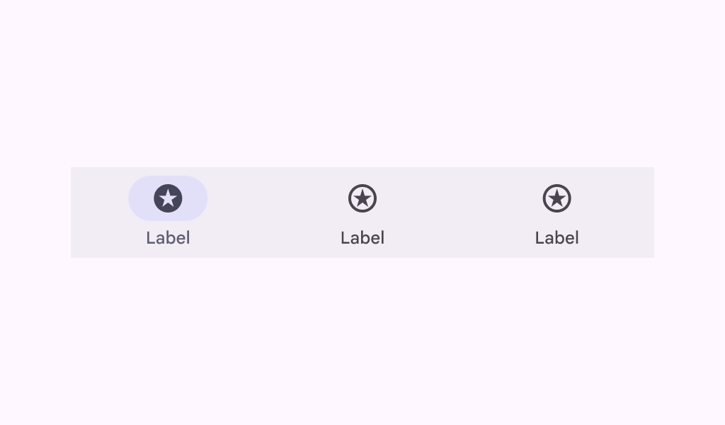
Material Design short navigation bar.
Common
@Composable
fun ShortNavigationBar(
    modifier: Modifier = Modifier,
    containerColor: Color = ShortNavigationBarDefaults.containerColor,
    contentColor: Color = ShortNavigationBarDefaults.contentColor,
    windowInsets: WindowInsets = ShortNavigationBarDefaults.windowInsets,
    arrangement: ShortNavigationBarArrangement = ShortNavigationBarDefaults.arrangement,
    content: @Composable () -> Unit,
)
Parameters
| modifier | the Modifier to be applied to this navigation bar |
| containerColor | the color used for the background of this navigation bar. Use Color.Transparent to have no color |
| contentColor | the color for content inside this navigation bar. |
| windowInsets | a window insets of the navigation bar |
| arrangement | the ShortNavigationBarArrangement of this navigation bar |
| content | the content of this navigation bar, typically ShortNavigationBarItems |
Code Examples
ShortNavigationBarSample
@Preview
@Composable
fun ShortNavigationBarSample() {
    var selectedItem by remember { mutableIntStateOf(0) }
    val items = listOf("Songs", "Artists", "Playlists")
    val selectedIcons = listOf(Icons.Filled.Home, Icons.Filled.Favorite, Icons.Filled.Star)
    val unselectedIcons =
        listOf(Icons.Outlined.Home, Icons.Outlined.FavoriteBorder, Icons.Outlined.StarBorder)
    ShortNavigationBar {
        items.forEachIndexed { index, item ->
            ShortNavigationBarItem(
                icon = {
                    Icon(
                        if (selectedItem == index) selectedIcons[index] else unselectedIcons[index],
                        contentDescription = null,
                    )
                },
                label = { Text(item) },
                selected = selectedItem == index,
                onClick = { selectedItem = index },
            )
        }
    }
}
ShortNavigationBarWithHorizontalItemsSample
@Preview
@Composable
fun ShortNavigationBarWithHorizontalItemsSample() {
    var selectedItem by remember { mutableIntStateOf(0) }
    val items = listOf("Songs", "Artists", "Playlists")
    val selectedIcons = listOf(Icons.Filled.Home, Icons.Filled.Favorite, Icons.Filled.Star)
    val unselectedIcons =
        listOf(Icons.Outlined.Home, Icons.Outlined.FavoriteBorder, Icons.Outlined.StarBorder)
    Column {
        Text(
            "Note: this is configuration is better displayed in medium screen sizes.",
            Modifier.padding(16.dp),
        )
        Spacer(Modifier.height(32.dp))
        ShortNavigationBar(arrangement = ShortNavigationBarArrangement.Centered) {
            items.forEachIndexed { index, item ->
                ShortNavigationBarItem(
                    iconPosition = NavigationItemIconPosition.Start,
                    icon = {
                        Icon(
                            if (selectedItem == index) selectedIcons[index]
                            else unselectedIcons[index],
                            contentDescription = null,
                        )
                    },
                    label = { Text(item) },
                    selected = selectedItem == index,
                    onClick = { selectedItem = index },
                )
            }
        }
    }
}
Create your own Component Library
Material Components are meant to be used as is and they do not allow customizations. To build your own Jetpack Compose component library use Compose Unstyled

