ExposedDropdownMenuBox
Composable Component
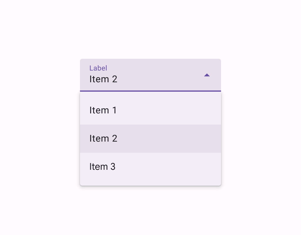
Menus display a list of choices on a temporary surface. They appear when users interact with a button, action, or other control.
Common
@ExperimentalMaterial3Api
@Composable
fun ExposedDropdownMenuBox(
    expanded: Boolean,
    onExpandedChange: (Boolean) -> Unit,
    modifier: Modifier = Modifier,
    content: @Composable ExposedDropdownMenuBoxScope.() -> Unit,
)
Parameters
| expanded | whether the menu is expanded or not |
| onExpandedChange | called when the exposed dropdown menu is clicked and the expansion state changes. |
| modifier | the Modifier to be applied to this ExposedDropdownMenuBox |
| content | the content of this ExposedDropdownMenuBox, typically a TextField and an ExposedDropdownMenu. |
Code Examples
EditableExposedDropdownMenuSample
@Preview
@Composable
fun EditableExposedDropdownMenuSample() {
    val options: List<String> = SampleData
    val textFieldState = rememberTextFieldState()
    // The text that the user inputs into the text field can be used to filter the options.
    // This sample uses string subsequence matching.
    val filteredOptions = options.filteredBy(textFieldState.text)
    val (allowExpanded, setExpanded) = remember { mutableStateOf(false) }
    val expanded = allowExpanded && filteredOptions.isNotEmpty()
    ExposedDropdownMenuBox(expanded = expanded, onExpandedChange = setExpanded) {
        TextField(
            // The `menuAnchor` modifier must be passed to the text field to handle
            // expanding/collapsing the menu on click. An editable text field has
            // the anchor type `PrimaryEditable`.
            modifier =
                Modifier.width(280.dp).menuAnchor(ExposedDropdownMenuAnchorType.PrimaryEditable),
            state = textFieldState,
            lineLimits = TextFieldLineLimits.SingleLine,
            label = { Text("Label") },
            trailingIcon = {
                ExposedDropdownMenuDefaults.TrailingIcon(
                    expanded = expanded,
                    // If the text field is editable, it is recommended to make the
                    // trailing icon a `menuAnchor` of type `SecondaryEditable`. This
                    // provides a better experience for certain accessibility services
                    // to choose a menu option without typing.
                    modifier = Modifier.menuAnchor(ExposedDropdownMenuAnchorType.SecondaryEditable),
                )
            },
            colors = ExposedDropdownMenuDefaults.textFieldColors(),
        )
        ExposedDropdownMenu(
            modifier = Modifier.heightIn(max = 280.dp),
            expanded = expanded,
            onDismissRequest = { setExpanded(false) },
        ) {
            filteredOptions.forEach { option ->
                DropdownMenuItem(
                    text = { Text(option, style = MaterialTheme.typography.bodyLarge) },
                    onClick = {
                        textFieldState.setTextAndPlaceCursorAtEnd(option.text)
                        setExpanded(false)
                    },
                    contentPadding = ExposedDropdownMenuDefaults.ItemContentPadding,
                )
            }
        }
    }
}
ExposedDropdownMenuSample
@Preview
@Composable
fun ExposedDropdownMenuSample() {
    val options: List<String> = SampleData.take(5)
    var expanded by remember { mutableStateOf(false) }
    val textFieldState = rememberTextFieldState(options[0])
    ExposedDropdownMenuBox(expanded = expanded, onExpandedChange = { expanded = it }) {
        TextField(
            // The `menuAnchor` modifier must be passed to the text field to handle
            // expanding/collapsing the menu on click. A read-only text field has
            // the anchor type `PrimaryNotEditable`.
            modifier = Modifier.menuAnchor(ExposedDropdownMenuAnchorType.PrimaryNotEditable),
            state = textFieldState,
            readOnly = true,
            lineLimits = TextFieldLineLimits.SingleLine,
            label = { Text("Label") },
            trailingIcon = { ExposedDropdownMenuDefaults.TrailingIcon(expanded = expanded) },
            colors = ExposedDropdownMenuDefaults.textFieldColors(),
        )
        ExposedDropdownMenu(expanded = expanded, onDismissRequest = { expanded = false }) {
            options.forEach { option ->
                DropdownMenuItem(
                    text = { Text(option, style = MaterialTheme.typography.bodyLarge) },
                    onClick = {
                        textFieldState.setTextAndPlaceCursorAtEnd(option)
                        expanded = false
                    },
                    contentPadding = ExposedDropdownMenuDefaults.ItemContentPadding,
                )
            }
        }
    }
}
MultiAutocompleteExposedDropdownMenuSample
@Preview
@Composable
fun MultiAutocompleteExposedDropdownMenuSample() {
    /**
     * Returns the TextRange of the current token around the cursor, where commas define token
     * boundaries.
     */
    fun TextFieldState.currentTokenRange(): TextRange? {
        if (!selection.collapsed) return null
        val cursor = selection.start
        var start = cursor
        while (start > 0 && text[start - 1] != ',') {
            start--
        }
        while (start < cursor && text[start] == ' ') {
            start++
        }
        var end = cursor
        while (end < text.length && text[end] != ',') {
            end++
        }
        return TextRange(start, end)
    }
    fun TextFieldState.replaceThenAddComma(start: Int, end: Int, text: CharSequence) = edit {
        replace(start, end, text)
        val afterText = start + text.length
        if (afterText == this.length || this.charAt(afterText) != ',') {
            insert(afterText, ", ")
            placeCursorBeforeCharAt(afterText + 2)
        } else {
            placeCursorAfterCharAt(afterText)
        }
    }
    val allOptions: List<String> = SampleData
    val textFieldState = rememberTextFieldState()
    val tokenSelection = textFieldState.currentTokenRange()
    val tokenAtCursor =
        if (tokenSelection != null) textFieldState.text.substring(tokenSelection) else ""
    val filteredOptions =
        if (tokenAtCursor.isBlank()) emptyList() else allOptions.filteredBy(tokenAtCursor)
    val (allowExpanded, setExpanded) = remember { mutableStateOf(false) }
    val expanded = allowExpanded && filteredOptions.isNotEmpty()
    ExposedDropdownMenuBox(expanded = expanded, onExpandedChange = setExpanded) {
        TextField(
            modifier =
                Modifier.width(280.dp).menuAnchor(ExposedDropdownMenuAnchorType.PrimaryEditable),
            state = textFieldState,
            lineLimits = TextFieldLineLimits.SingleLine,
            label = { Text("Label") },
            trailingIcon = {
                ExposedDropdownMenuDefaults.TrailingIcon(
                    expanded = expanded,
                    modifier = Modifier.menuAnchor(ExposedDropdownMenuAnchorType.SecondaryEditable),
                )
            },
            colors = ExposedDropdownMenuDefaults.textFieldColors(),
        )
        ExposedDropdownMenu(
            modifier = Modifier.heightIn(max = 280.dp),
            expanded = expanded,
            onDismissRequest = { setExpanded(false) },
        ) {
            filteredOptions.forEach { option ->
                DropdownMenuItem(
                    text = { Text(option, style = MaterialTheme.typography.bodyLarge) },
                    onClick = {
                        if (tokenSelection != null) {
                            textFieldState.replaceThenAddComma(
                                tokenSelection.start,
                                tokenSelection.end,
                                option,
                            )
                        }
                    },
                    contentPadding = ExposedDropdownMenuDefaults.ItemContentPadding,
                )
            }
        }
    }
}
Create your own Component Library
Material Components are meant to be used as is and they do not allow customizations. To build your own Jetpack Compose component library use Compose Unstyled

