BasicAlertDialog
Composable Component
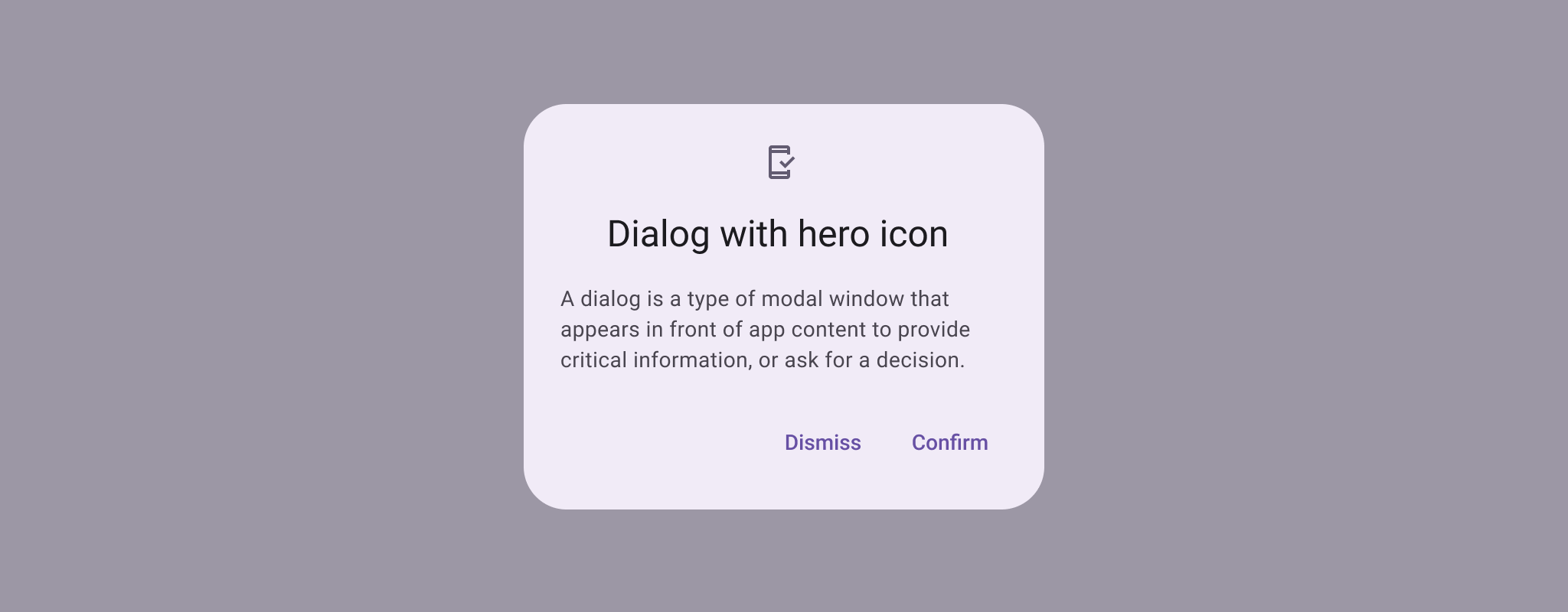
Dialogs provide important prompts in a user flow. They can require an action, communicate information, or help users accomplish a task.
Common
@ExperimentalMaterial3Api
@Composable
fun BasicAlertDialog(
    onDismissRequest: () -> Unit,
    modifier: Modifier = Modifier,
    properties: DialogProperties = DialogProperties(),
    content: @Composable () -> Unit,
)
Parameters
| onDismissRequest | called when the user tries to dismiss the Dialog by clicking outside or pressing the back button. This is not called when the dismiss button is clicked. |
| modifier | the Modifier to be applied to this dialog's content. |
| properties | typically platform specific properties to further configure the dialog. |
| content | the content of the dialog |
Code Examples
BasicAlertDialogSample
@Preview
@OptIn(ExperimentalMaterial3Api::class)
@Composable
fun BasicAlertDialogSample() {
    val openDialog = remember { mutableStateOf(true) }
    if (openDialog.value) {
        BasicAlertDialog(
            onDismissRequest = {
                // Dismiss the dialog when the user clicks outside the dialog or on the back
                // button. If you want to disable that functionality, simply use an empty
                // onDismissRequest.
                openDialog.value = false
            }
        ) {
            Surface(
                modifier = Modifier.wrapContentWidth().wrapContentHeight(),
                shape = MaterialTheme.shapes.large,
                tonalElevation = AlertDialogDefaults.TonalElevation,
            ) {
                Column(modifier = Modifier.padding(16.dp)) {
                    Text(
                        text =
                            "This area typically contains the supportive text " +
                                "which presents the details regarding the Dialog's purpose."
                    )
                    Spacer(modifier = Modifier.height(24.dp))
                    TextButton(
                        onClick = { openDialog.value = false },
                        modifier = Modifier.align(Alignment.End),
                    ) {
                        Text("Confirm")
                    }
                }
            }
        }
    }
}
Create your own Component Library
Material Components are meant to be used as is and they do not allow customizations. To build your own Jetpack Compose component library use Compose Unstyled
