NavigationBar
Composable Component
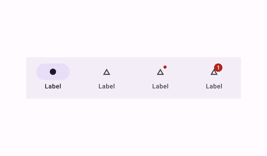
Navigation bars offer a persistent and convenient way to switch between primary destinations in an app.
Common
@Composable
fun NavigationBar(
    modifier: Modifier = Modifier,
    containerColor: Color = NavigationBarDefaults.containerColor,
    contentColor: Color = MaterialTheme.colorScheme.contentColorFor(containerColor),
    tonalElevation: Dp = NavigationBarDefaults.Elevation,
    windowInsets: WindowInsets = NavigationBarDefaults.windowInsets,
    content: @Composable RowScope.() -> Unit,
)
Parameters
| modifier | the Modifier to be applied to this navigation bar |
| containerColor | the color used for the background of this navigation bar. Use Color.Transparent to have no color. |
| contentColor | the preferred color for content inside this navigation bar. Defaults to either the matching content color for containerColor, or to the current LocalContentColor if containerColor is not a color from the theme. |
| tonalElevation | when containerColor is ColorScheme.surface, a translucent primary color overlay is applied on top of the container. A higher tonal elevation value will result in a darker color in light theme and lighter color in dark theme. See also: Surface. |
| windowInsets | a window insets of the navigation bar. |
| content | the content of this navigation bar, typically 3-5 NavigationBarItems |
Code Examples
NavigationBarSample
@Preview
@Composable
fun NavigationBarSample() {
    var selectedItem by remember { mutableIntStateOf(0) }
    val items = listOf("Songs", "Artists", "Playlists")
    val selectedIcons = listOf(Icons.Filled.Home, Icons.Filled.Favorite, Icons.Filled.Star)
    val unselectedIcons =
        listOf(Icons.Outlined.Home, Icons.Outlined.FavoriteBorder, Icons.Outlined.StarBorder)
    NavigationBar {
        items.forEachIndexed { index, item ->
            NavigationBarItem(
                icon = {
                    Icon(
                        if (selectedItem == index) selectedIcons[index] else unselectedIcons[index],
                        contentDescription = item,
                    )
                },
                label = { Text(item) },
                selected = selectedItem == index,
                onClick = { selectedItem = index },
            )
        }
    }
}
Create your own Component Library
Material Components are meant to be used as is and they do not allow customizations. To build your own Jetpack Compose component library use Compose Unstyled

