PermanentNavigationDrawer
Composable Component
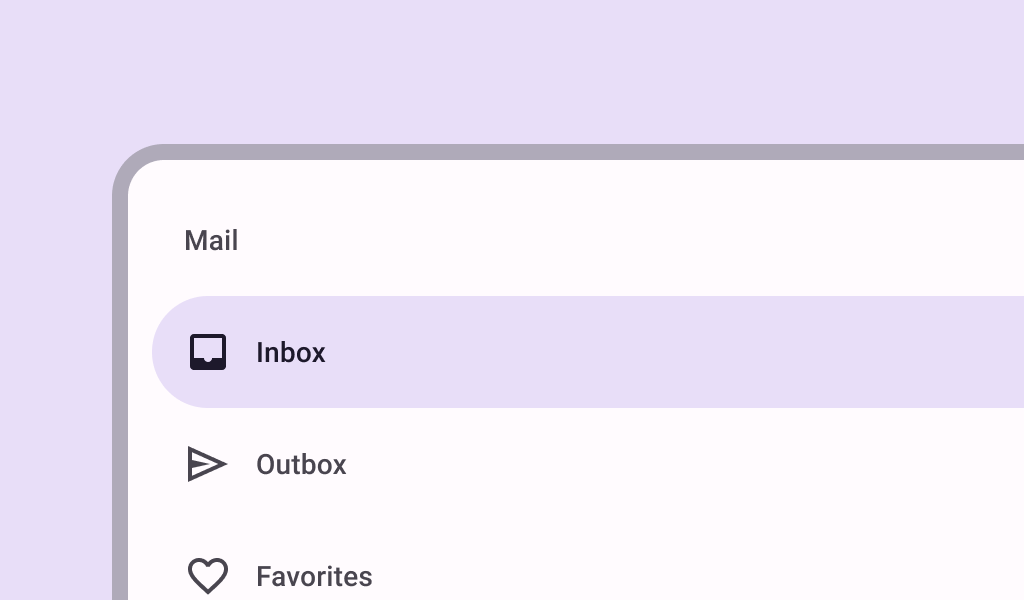
Navigation drawers provide ergonomic access to destinations in an app. They’re often next to app content and affect the screen’s layout grid.
Common
@Composable
fun PermanentNavigationDrawer(
    drawerContent: @Composable () -> Unit,
    modifier: Modifier = Modifier,
    content: @Composable () -> Unit,
)
Parameters
| drawerContent | content inside this drawer |
| modifier | the Modifier to be applied to this drawer |
| content | content of the rest of the UI |
Code Examples
PermanentNavigationDrawerSample
@Preview
@Composable
fun PermanentNavigationDrawerSample() {
    // icons to mimic drawer destinations
    val items =
        listOf(
            Icons.Default.AccountCircle,
            Icons.Default.Bookmarks,
            Icons.Default.CalendarMonth,
            Icons.Default.Dashboard,
            Icons.Default.Email,
            Icons.Default.Favorite,
            Icons.Default.Group,
            Icons.Default.Headphones,
            Icons.Default.Image,
            Icons.Default.JoinFull,
            Icons.Default.Keyboard,
            Icons.Default.Laptop,
            Icons.Default.Map,
            Icons.Default.Navigation,
            Icons.Default.Outbox,
            Icons.Default.PushPin,
            Icons.Default.QrCode,
            Icons.Default.Radio,
        )
    val selectedItem = remember { mutableStateOf(items[0]) }
    PermanentNavigationDrawer(
        drawerContent = {
            PermanentDrawerSheet(Modifier.width(240.dp)) {
                Column(Modifier.verticalScroll(rememberScrollState())) {
                    Spacer(Modifier.height(12.dp))
                    items.forEach { item ->
                        NavigationDrawerItem(
                            icon = { Icon(item, contentDescription = null) },
                            label = { Text(item.name.substringAfterLast(".")) },
                            selected = item == selectedItem.value,
                            onClick = { selectedItem.value = item },
                            modifier = Modifier.padding(horizontal = 12.dp),
                        )
                    }
                }
            }
        },
        content = {
            Column(
                modifier = Modifier.fillMaxSize().padding(16.dp),
                horizontalAlignment = Alignment.CenterHorizontally,
            ) {
                Text(text = "Application content")
            }
        },
    )
}
Create your own Component Library
Material Components are meant to be used as is and they do not allow customizations. To build your own Jetpack Compose component library use Compose Unstyled

