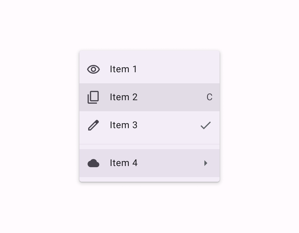
DropdownMenu
Menus display a list of choices on a temporary surface. They appear when users interact with a
DropdownMenu
Composable Component
Menus display a list of choices on a temporary surface. They appear when users interact with a button, action, or other control.
Common
@Composable
expect fun DropdownMenu(
    expanded: Boolean,
    onDismissRequest: () -> Unit,
    modifier: Modifier = Modifier,
    offset: DpOffset = DpOffset(0.dp, 0.dp),
    scrollState: ScrollState = rememberScrollState(),
    properties: PopupProperties = DefaultMenuProperties,
    shape: Shape = MenuDefaults.shape,
    containerColor: Color = MenuDefaults.containerColor,
    tonalElevation: Dp = MenuDefaults.TonalElevation,
    shadowElevation: Dp = MenuDefaults.ShadowElevation,
    border: BorderStroke? = null,
    content: @Composable ColumnScope.() -> Unit,
)
Parameters
| expanded | whether the menu is expanded or not |
| onDismissRequest | called when the user requests to dismiss the menu, such as by tapping outside the menu's bounds |
| modifier | Modifier to be applied to the menu's content |
| offset | DpOffset from the original position of the menu. The offset respects the LayoutDirection, so the offset's x position will be added in LTR and subtracted in RTL. |
| scrollState | a ScrollState to used by the menu's content for items vertical scrolling |
| properties | PopupProperties for further customization of this popup's behavior |
| shape | the shape of the menu |
| containerColor | the container color of the menu |
| tonalElevation | when containerColor is ColorScheme.surface, a translucent primary color overlay is applied on top of the container. A higher tonal elevation value will result in a darker color in light theme and lighter color in dark theme. See also: Surface. |
| shadowElevation | the elevation for the shadow below the menu |
| border | the border to draw around the container of the menu. Pass null for no border. |
| content | the content of this dropdown menu, typically a DropdownMenuItem |
Android
@Composable
actual fun DropdownMenu(
    expanded: Boolean,
    onDismissRequest: () -> Unit,
    modifier: Modifier,
    offset: DpOffset,
    scrollState: ScrollState,
    properties: PopupProperties,
    shape: Shape,
    containerColor: Color,
    tonalElevation: Dp,
    shadowElevation: Dp,
    border: BorderStroke?,
    content: @Composable ColumnScope.() -> Unit,
)
Android
Deprecated Maintained for binary compatibility. Use overload with parameters for shape, color, elevation, and border.
@Composable
@SuppressLint("ComposableNaming")
fun DropdownMenu(
    expanded: Boolean,
    onDismissRequest: () -> Unit,
    modifier: Modifier = Modifier,
    offset: DpOffset = DpOffset(0.dp, 0.dp),
    scrollState: ScrollState = rememberScrollState(),
    properties: PopupProperties = PopupProperties(focusable = true),
    content: @Composable ColumnScope.() -> Unit,
) =
    DropdownMenu(
        expanded = expanded,
        onDismissRequest = onDismissRequest,
        modifier = modifier,
        offset = offset,
        scrollState = scrollState,
        properties = properties,
        shape = MenuDefaults.shape,
        containerColor = MenuDefaults.containerColor,
        tonalElevation = MenuDefaults.TonalElevation,
        shadowElevation = MenuDefaults.ShadowElevation,
        border = null,
        content = content,
    )
Android
Deprecated Replaced by a DropdownMenu function with a ScrollState parameter
@Composable
@SuppressLint("ComposableNaming")
fun DropdownMenu(
    expanded: Boolean,
    onDismissRequest: () -> Unit,
    modifier: Modifier = Modifier,
    offset: DpOffset = DpOffset(0.dp, 0.dp),
    properties: PopupProperties = PopupProperties(focusable = true),
    content: @Composable ColumnScope.() -> Unit,
) =
    DropdownMenu(
        expanded = expanded,
        onDismissRequest = onDismissRequest,
        modifier = modifier,
        offset = offset,
        scrollState = rememberScrollState(),
        properties = properties,
        content = content,
    )
Code Examples
MenuSample
@OptIn(ExperimentalMaterial3Api::class)
@Preview
@Composable
fun MenuSample() {
    var expanded by remember { mutableStateOf(false) }
    Box(modifier = Modifier.fillMaxSize().wrapContentSize(Alignment.TopStart)) {
        val description = "Localized description"
        // Icon button should have a tooltip associated with it for a11y.
        TooltipBox(
            positionProvider =
                TooltipDefaults.rememberTooltipPositionProvider(TooltipAnchorPosition.Above),
            tooltip = { PlainTooltip { Text(description) } },
            state = rememberTooltipState(),
        ) {
            IconButton(onClick = { expanded = true }) {
                Icon(Icons.Default.MoreVert, contentDescription = description)
            }
        }
        DropdownMenu(expanded = expanded, onDismissRequest = { expanded = false }) {
            DropdownMenuItem(
                text = { Text("Edit") },
                onClick = { /* Handle edit! */ },
                leadingIcon = { Icon(Icons.Outlined.Edit, contentDescription = null) },
            )
            DropdownMenuItem(
                text = { Text("Settings") },
                onClick = { /* Handle settings! */ },
                leadingIcon = { Icon(Icons.Outlined.Settings, contentDescription = null) },
            )
            HorizontalDivider()
            DropdownMenuItem(
                text = { Text("Send Feedback") },
                onClick = { /* Handle send feedback! */ },
                leadingIcon = { Icon(Icons.Outlined.Email, contentDescription = null) },
                trailingIcon = { Text("F11", textAlign = TextAlign.Center) },
            )
        }
    }
}
MenuWithScrollStateSample
@OptIn(ExperimentalMaterial3Api::class)
@Preview
@Composable
fun MenuWithScrollStateSample() {
    var expanded by remember { mutableStateOf(false) }
    val scrollState = rememberScrollState()
    Box(modifier = Modifier.fillMaxSize().wrapContentSize(Alignment.TopStart)) {
        val description = "Localized description"
        // Icon button should have a tooltip associated with it for a11y.
        TooltipBox(
            positionProvider =
                TooltipDefaults.rememberTooltipPositionProvider(TooltipAnchorPosition.Above),
            tooltip = { PlainTooltip { Text(description) } },
            state = rememberTooltipState(),
        ) {
            IconButton(onClick = { expanded = true }) {
                Icon(Icons.Default.MoreVert, contentDescription = description)
            }
        }
        DropdownMenu(
            expanded = expanded,
            onDismissRequest = { expanded = false },
            scrollState = scrollState,
        ) {
            repeat(30) {
                DropdownMenuItem(
                    text = { Text("Item ${it + 1}") },
                    onClick = { /* TODO */ },
                    leadingIcon = { Icon(Icons.Outlined.Edit, contentDescription = null) },
                )
            }
        }
        LaunchedEffect(expanded) {
            if (expanded) {
                // Scroll to show the bottom menu items.
                scrollState.scrollTo(scrollState.maxValue)
            }
        }
    }
}
Create your own Component Library
Material Components are meant to be used as is and they do not allow customizations. To build your own Jetpack Compose component library use Compose Unstyled


