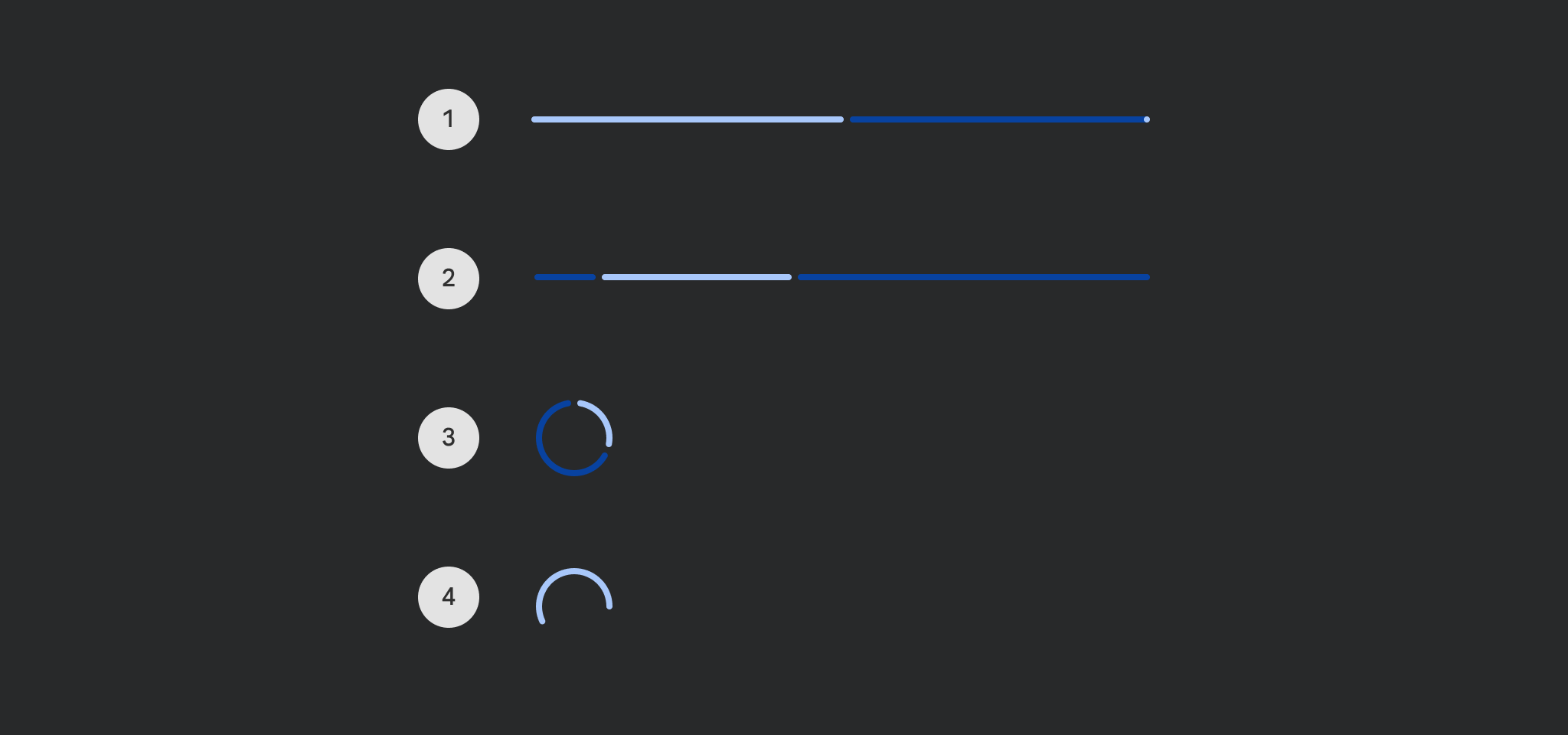
LinearProgressIndicator
Deprecated
Use the overload that takes gapSize and drawStopIndicator, see LegacyLinearProgressIndicatorSample on how to restore the previous behavior
Source set: Common
@Composable
fun LinearProgressIndicator(
    progress: () -> Float,
    modifier: Modifier = Modifier,
    color: Color = ProgressIndicatorDefaults.linearColor,
    trackColor: Color = ProgressIndicatorDefaults.linearTrackColor,
    strokeCap: StrokeCap = ProgressIndicatorDefaults.LinearStrokeCap,
)
Parameters
| progress | the progress of this progress indicator, where 0.0 represents no progress and 1.0 represents full progress. Values outside of this range are coerced into the range. |
| modifier | the Modifier to be applied to this progress indicator |
| color | color of this progress indicator |
| trackColor | color of the track behind the indicator, visible when the progress has not reached the area of the overall indicator yet |
| strokeCap | stroke cap to use for the ends of this progress indicator |
LinearProgressIndicator
Source set: Common
@Composable
fun LinearProgressIndicator(
    progress: () -> Float,
    modifier: Modifier = Modifier,
    color: Color = ProgressIndicatorDefaults.linearColor,
    trackColor: Color = ProgressIndicatorDefaults.linearTrackColor,
    strokeCap: StrokeCap = ProgressIndicatorDefaults.LinearStrokeCap,
    gapSize: Dp = ProgressIndicatorDefaults.LinearIndicatorTrackGapSize,
    drawStopIndicator: DrawScope.() -> Unit = {
        drawStopIndicator(
            drawScope = this,
            stopSize = ProgressIndicatorDefaults.LinearTrackStopIndicatorSize,
            color = color,
            strokeCap = strokeCap,
        )
    },
)
Parameters
| progress | the progress of this progress indicator, where 0.0 represents no progress and 1.0 represents full progress. Values outside of this range are coerced into the range. |
| modifier | the Modifier to be applied to this progress indicator |
| color | color of this progress indicator |
| trackColor | color of the track behind the indicator, visible when the progress has not reached the area of the overall indicator yet |
| strokeCap | stroke cap to use for the ends of this progress indicator |
| gapSize | size of the gap between the progress indicator and the track |
| drawStopIndicator | lambda that will be called to draw the stop indicator. Note that a custom indicator implementation should also handle RTL layouts. |
LinearProgressIndicator
Deprecated
Use the overload that takes gapSize, see LegacyIndeterminateLinearProgressIndicatorSample on how to restore the previous behavior
Source set: Common
@Composable
fun LinearProgressIndicator(
    modifier: Modifier = Modifier,
    color: Color = ProgressIndicatorDefaults.linearColor,
    trackColor: Color = ProgressIndicatorDefaults.linearTrackColor,
    strokeCap: StrokeCap = ProgressIndicatorDefaults.LinearStrokeCap,
)
Parameters
| modifier | the Modifier to be applied to this progress indicator |
| color | color of this progress indicator |
| trackColor | color of the track behind the indicator, visible when the progress has not reached the area of the overall indicator yet |
| strokeCap | stroke cap to use for the ends of this progress indicator |
LinearProgressIndicator
Source set: Common
@Composable
fun LinearProgressIndicator(
    modifier: Modifier = Modifier,
    color: Color = ProgressIndicatorDefaults.linearColor,
    trackColor: Color = ProgressIndicatorDefaults.linearTrackColor,
    strokeCap: StrokeCap = ProgressIndicatorDefaults.LinearStrokeCap,
    gapSize: Dp = ProgressIndicatorDefaults.LinearIndicatorTrackGapSize,
)
Parameters
| modifier | the Modifier to be applied to this progress indicator |
| color | color of this progress indicator |
| trackColor | color of the track behind the indicator, visible when the progress has not reached the area of the overall indicator yet |
| strokeCap | stroke cap to use for the ends of this progress indicator |
| gapSize | size of the gap between the progress indicator and the track |
LinearProgressIndicator
Deprecated
Use the overload that takes progress as a lambda
Source set: Common
@Composable
fun LinearProgressIndicator(
    progress: Float,
    modifier: Modifier = Modifier,
    color: Color = ProgressIndicatorDefaults.linearColor,
    trackColor: Color = ProgressIndicatorDefaults.linearTrackColor,
    strokeCap: StrokeCap = ProgressIndicatorDefaults.LinearStrokeCap,
) =
    LinearProgressIndicator(
        progress = { progress },
        modifier = modifier,
        color = color,
        trackColor = trackColor,
        strokeCap = strokeCap,
    )
LinearProgressIndicator
Deprecated
Maintained for binary compatibility
Source set: Common
@Composable
fun LinearProgressIndicator(
    progress: Float,
    modifier: Modifier = Modifier,
    color: Color = ProgressIndicatorDefaults.linearColor,
    trackColor: Color = ProgressIndicatorDefaults.linearTrackColor,
) =
    LinearProgressIndicator(
        progress,
        modifier,
        color,
        trackColor,
        strokeCap = ProgressIndicatorDefaults.LinearStrokeCap,
    )
LinearProgressIndicator
Deprecated
Maintained for binary compatibility
Source set: Common
@Composable
fun LinearProgressIndicator(
    modifier: Modifier = Modifier,
    color: Color = ProgressIndicatorDefaults.linearColor,
    trackColor: Color = ProgressIndicatorDefaults.linearTrackColor,
) =
    LinearProgressIndicator(
        modifier,
        color,
        trackColor,
        strokeCap = ProgressIndicatorDefaults.LinearStrokeCap,
    )