Badge
Common
Component in Material 3 Compose
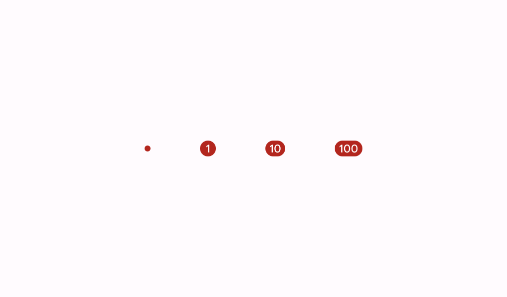
A badge represents dynamic information such as a number of pending requests in a navigation bar.
Badges can be icon only or contain short text.
Last updated:
Installation
dependencies {
   implementation("androidx.compose.material3:material3:1.4.0-alpha17")
}
Overloads
@Composable
fun Badge(
    modifier: Modifier = Modifier,
    containerColor: Color = BadgeDefaults.containerColor,
    contentColor: Color = contentColorFor(containerColor),
    content: @Composable (RowScope.() -> Unit)? = null,
)
Parameters
| name | description |
|---|---|
modifier | the [Modifier] to be applied to this badge |
containerColor | the color used for the background of this badge |
contentColor | the preferred color for content inside this badge. Defaults to either the matching content color for [containerColor], or to the current [LocalContentColor] if [containerColor] is not a color from the theme. |
content | optional content to be rendered inside this badge |
